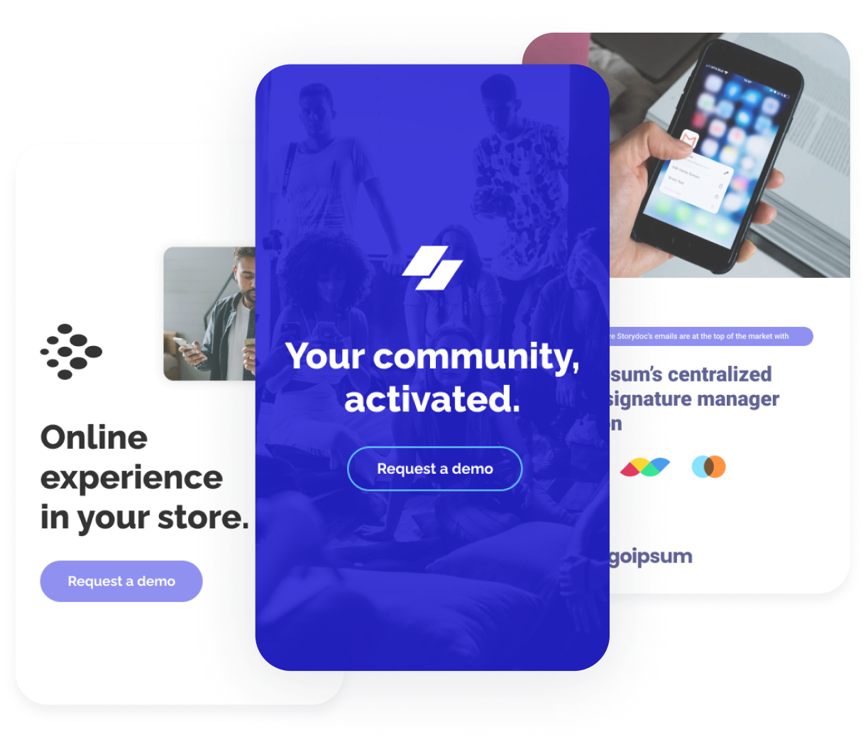
Still using PPT, Google Slides or Keynote for presentations? Here’s why you should reconsider

Before computers were invented and popularized, people used to present stuff using physical slides.

When a client wanted something to show to their team internally, after a meeting, they’d get a paper brochure. And then… Microsoft came to be.

analytics_default
analytics_default

In 1987, Micorsoft revolutionized the world of presentations by introducing PowerPoint.

Suddenly, you had the option to support your in-person presentation with a digital rendition of slides.

You could give your slides to a client on a floppy disk. It was game-changing. Apple followed suit and created Keynote; arguably, a leaner, fancier version of digital slide software.

Later, Google took the digital slides technology to the cloud. With Google Slides, we no longer need physical data transmitters. Everything happens online.

So far so good, right?

analytics_default

Not quite. Let’s take a step back to see the big picture. PowerPoint is over 35 years old. If you take a look at what its early iterations looked like, you’d be shocked. Shocked by how little changed.

If you’re using any type of slide-based presentation software for business, it means you’re relying on 35-year old technology, in a world where so much evolved over said 35 years.

Nowadays your clients are overwhelmed with information. They’re used to consuming that information in the form of modern landing pages, insta stories, TikToks.

Static slides will never win their attention. But— There’s something that will:

Storydoc.

Converting readers into customers

Storydoc has been optimized for performance. It’s not just some fancy software that makes pretty things. The slide UX is designed to optimize your engagement metrics.

When our clients switched from slides to using Storydoc, they enjoyed: a 70% uptick in new customers, a twofold increase in demos booked, and a 30% reduction in closing time.

Storydoc decks have smart CTAs you can integrate with your calendar and let prospects book demos straight from the deck.

They’re created for informational, not persuasive purposes. Only if your clients are really into the topic, will they read them. It won’t convince anyone that wasn’t convinced before.

Difficult to include a clear CTA and impossible to integrate a calendar to make booking a demo simple.

You can’t include an actionable CTA in a static slide deck. Even if there’s a button, it will open in a new tab and kill the smooth experience.

Slides give off a classroom kind of vibe. They feel like school all over again. You don’t want your customer to feel like your deck is homework.

Slides are boring. There, we said it. But it’s not us who coined the term “Death by PowerPoint.”

Ease of design

Storydoc lets you design on autopilot. Even if you try very hard, you won’t be able to create an ugly deck.

You can add stuff, remove stuff, change the order. The layout aligns automatically.

Storydoc makes sure you always stay on brand by auto-extracting your key visuals.

You get access to a rich library of stock photos and videos right on the platform.

You need to be a design pro (or at least very proficient) to make the deck look half-decent.

Moving an element around is a pain and can break the formatting of the slide.

You have no readily-available visuals to use. Anything you want to add, you need to download from the web first.

The slides need to follow a pre-designed pattern. Creating a custom slide is virtually impossible for a newbie.

Personalization options

You can create unlimited personalized versions of a deck. Automatically.

Storydoc pulls data from your CRM, all you need to do is select the variables.

Reps can add prospects' names, logos, or personal notes without even having to open the deck. No chance to break the design.

No option to personalize decks in bulk.

Personalizing decks is slow and tedious. Not even talking about “stupid” mistakes like leaving the wrong company name in a slide.

Non-design-savvy reps can make the design go haywire when adding personalized materials.

Visualizing data

Data is interactive and animated, making it easy for your customer to understand it and follow a narrative.

Countless data visualization formats you can adjust to your use case.

Data visualization features automatically adjust their design to the branding of the whole deck. Every data slide added automatically uses your brand colors in the best way possible.

Makes data look beautiful, interesting, and, most importantly, easy to grasp.

No dedicated features for data visualization.

If you want to visualize data in your deck, you need to import dataviz from external sources.

Charts cannot be animated, they look complex and non-inviting to your prospects.

Impossible to introduce real-time variables for charts.

You can’t tailor the reading experience to the exact, specific use case: PDFs are one-size-fits-all. And one-size-fits-all, in fact, fits no one.

Reader engagement

Scroll-based narrative takes your readers on a fully interactive ride they'll love.

Allows your prospects to "play around" with the deck: click through tabs, plug in their own numbers to an ROI calculator, and more

Our studies have shown that interactivity (and not just animation) boosts average reading time by 22% and the completion rate (decks read in full) by 41%.

Best you can do is add cringeworthy animations that looked cool in the 1990s. Oh, and they won’t work once you send it as a PDF…

Your readers can just view consecutive slides. They don't feel like they're part of the show.

Slow, tedious, and alienating reader experience. Data shows that having to click after every slide reduces the number of people that will read it all the way down.

Mobile performance

Every component and template has been optimized for mobile performance. Why does it matter? 33% of decks are opened on mobile. That’s even more common towards the top of the funnel: close to 50% of outreach decks are opened on mobile.

We've discovered that mobile sessions of Storydoc decks were almost as long as the desktop ones, there was only about a 20% difference in average reading time.

Viewing on mobile requires endless pinching in and out to see the bits that interest you.

Most readers won't even put in the effort to finish reading your content on mobile. They'll immediately bounce.

Making tweaks and adjustments can derail the layout completely.

Slides are killing your message. Storydoc brings it to life.

PDFs are scientifically proven to be unfit for online use.

Don’t leave money on the table. Join the ranks of our happy customers. Leave your competition far behind by making your message stick.

See how Storydoc functionalities fare against PDFs ➜

analytics_default