How to Make Zuora's "Best Sales Deck Ever" Even Better

Is Andy Raskin's Zuora sales deck still the best sales deck ever? Here are some tweaks we made that will make its brilliant storyline shine again.

Dominika Krukowska

13 minute read

Zuora's best sales deck ever
Trusted by top companies:
client logo: meta
client logo: RTL
client logo: Yotpo
client logo: NetApp
client logo: healthy.io
client logo: deliverlight

This post will take you through all the principles that make Zuora's sale presentation the “best sales deck ever”. On top of those we added our high-level tweaks that make it even better.

Before we dive in, first take a close look at the entire refurbished Zuora sales deck, then we'll break each part down and explain why it works so well.


Zuora sales deck (interactive remake):

Zuora's content approach is timeless but their delivery is dated

You can find thousands of sales deck examples online, but have you seen what’s meant to be the best one out there?

The concept of the “best sales deck ever” came to life back in September 2016, when Andy Raskin wrote his viral post: The Greatest Sales Deck I’ve Ever Seen. In it, he outlined the 5 key elements of Zuora’s sales narrative that make their presentation the best sales deck ever created.

The concept behind Zuora’s pitch deck is brilliant. But, years on, its key message gets lost in the slide format.

In this article, I’ll show you a number of fixes we made to Zuora’s original pitch deck to move with the times and amplify its performance. You can apply each of these fixes to your own deck and see it perform on par with the best in the world.

Here’s what the original deck looked like (left) next to its new, supercharged version (right):

Static business proposal presentatio

Static

Interactive business proposal presentation

Interactive

5 main elements of a winning sales narrative

In his post, Andy Raskin argues that the reason why Zuora’s sales deck is so successful is because it swiftly leads prospects through 5 key elements of a sales narrative.


1. Present a shift that is happening in the world

One of the main mistakes most companies make is focusing on themselves right from the start. Instead, you should begin by painting a huge shift in the world that creates a big urgency for your prospect to make a change and big stakes for choosing to do so.

By choosing this approach over starting with a problem, you’re mitigating the risk of your prospects getting defensive. They may either be unaware or unwilling to admit they have a problem, and putting them on the spot could have the adverse effect.

Change, on the other hand, grabs people’s attention, especially when it directly affects them.

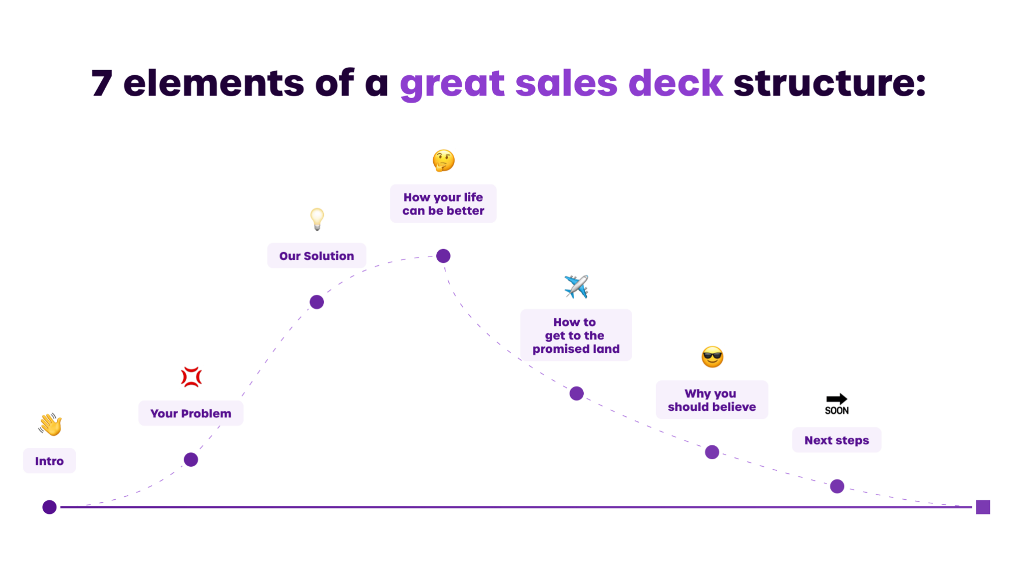
We found that the secret to making highly engaging sales decks is leveraging storytelling frameworks. If you want to take your prospects from casual to engaged, you should navigate them through a story that contains 7 main elements.

7 elements of a great sales deck structure

This way, you’ll captivate your audience and make them stick around until the end.


2. Divide people into winners and losers

Even though change gets people’s attention, sheer interest isn’t enough to get them to ditch the status quo. In behavioral economics, this is called loss aversion—a situation in which a person would rather stick to the current state rather than risk incurring a loss by making a change.

A way to beat loss aversion is to demonstrate that the big shift in the world will divide people into 2 groups: winners and losers. In other words, adapting to this change will have a highly positive impact on the prospect. Failure to adapt will result in a miserable future for them.

This simple trick works like a charm—I mean, who’d want to be a loser?


3. Entice prospects with the “Promised Land”

Another mistake many companies make is overloading prospects with information about their product or service without providing context.

Instead, you need to tease the Promised Land—the happily-ever-after state prospects will achieve by switching to your solution.

But, in order for this to work, it needs to meet 2 conditions. (1) Prospects have to find the Promised Land desirable. (2) You have to create a sense that it’s impossible to get there without the help of your solution. Otherwise, prospects could just tune out and look for alternative ways to reach the Promised Land.

And, note the use of the word “state”. It’s important that your Promised Land isn’t your solution. It’s the outcome your solution provides. It’s what life can be like thanks to your solution.


4. Treat features as stepping stones to the Promised Land

Sales narratives aren’t that different from films or fairytales, after all.

What do the most successful stories have in common? They all take you through a gripping storyline, from discovering there’s peril on the road you tread all the way down to the Promised Land, with several obstacles along the way.

But, where does your solution fit into this? In his original post, Andy Raskin used the perfect metaphor to illustrate this. He likened Zuora’s solution to the fairy godmother, helping Cinderella get to the ball by casting spells.

Instead of bombarding prospects with technical aspects of your solution, you need to position your solution’s features and capabilities as stepping stones to the Promised Land you teased earlier in the deck.

Not only does it sound less salesy, but it reinforces the belief in your solution as the only one capable of getting prospects to the desired state.


5. Prove that you can deliver on your promises

Finally, you need to make a promise: anyone who chooses to join you will reach the Promised Land.

But, the road to the Promised Land is winding, rocky, and littered with obstacles. So, if at this point prospects are still a little skeptical, they have every right to. The last thing that’s left is to show proof that you’re going to deliver on your promises.

Our own data here at Storydoc supports that Andy was right. We always recommend our customers add a “trust slide” right before the end. We saw that a customer quote or a slide with customer logos increases the conversion rate of the deck.

You need to keep selling when you’re no longer in the room

Let’s start with some context. What does Zuora actually do? Zuora is a company that offers a SaaS solution for subscription management. So, in simpler terms, if you pay for any subscription-based services, it’s likely Zuora manages those transactions.

it would be a huge mistake for Zuora, even having the best deck ever at their disposal, to assume they could simply send out their deck, and it would seal the deal.

It takes as little as 15 seconds for someone to decide whether they want to keep reading a deck. If your boss received Zuora’s sales deck without context, the most important thing they’d need to know is: why should they even care?

Many people mistakenly assume that decision-makers read every deck they get. The reality is, they briefly scroll through them and pick whatever they think is most important. If nothing grabs their attention enough to keep reading, they’ll bounce.

Even a narrative as brilliant as Zuora’s can get lost in a static presentation. What they need is a deck that people actually read and engage with, one that tells the pitch story for them when they’re no longer in the room.

Enter: Storydoc.

Disclaimer: The Storydoc team made this version of Zuora’s old deck based on the slides that are publicly available on this link. This was made for demonstration purposes and doesn’t represent a real Storydoc deck being used by the Zuora team.

Making Zuora’s best-sales-deck-ever great again


1. Replacing still images with video

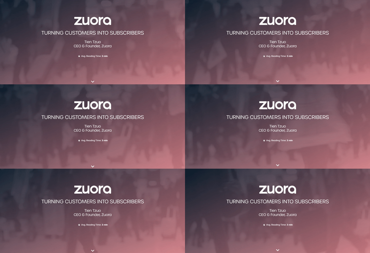
The cover of Zuora’s slide deck features a catchy tagline that encompasses the nature of their business, along with company logo and basic information about the founder.

Best sales deck ever cover slide

Most importantly, we switched the static image in the background to a video. Our study findings show that presentations with a video in the cover slide can boost interactions by 32% as compared to those with a static cover background.

Zuora sales deck improved cover slide

And the benefits of video are not limited to the top part of your sales pitch deck. By embedding any video, you can enjoy a 37% longer average reading time and increase your CTA click-through rate by 17%.


2. Setting readers’ expectations

Another tweak is actually the lowest-hanging fruit in the sales garden. We included information on the average reading time.

This simple bit of information will reduce the number of people who bounce off your deck right away by 24%. That’s right—just by adding this small blurb, you can have more eyes on your sales decks for longer.


3. Optimizing the deck for mobile performance

Nowadays, a third of all decks are opened on mobile devices. So, let me put it this way—if a company doesn’t optimize their decks for mobile performance, they’re losing 1 in 3 prospective customers. That one prospect you lost could very well be a critical decision-maker.

And the share of people reading decks on mobile increases the higher you go up the funnel: when it comes to initial outreach decks, almost 50% of them are opened on mobile.

In case nobody told you - PDFs were not made for mobile screens. They do not adapt themselves to mobile screen dimensions, which makes them virtually unreadable on mobile devices.

In stark contrast, all Storydoc components have been designed with mobile in mind and are 100% mobile-responsive. This way, you can be sure that your deck will look perfect regardless of the device it’s viewed on.

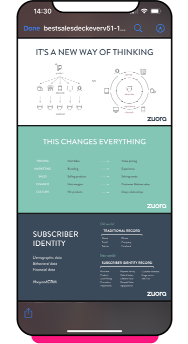
Don’t believe me? Just take a look at this slide from Zuora’s deck:

There’s so much tiny text crammed into this one screen that it’s practically illegible.

You have to keep pinching in and out in order to read anything, and even then there’s no telling which bits of information you should pay attention to.

Your orientation is disrupted and any context you could have had is lost. It makes for a really poor user experience.

I can assure you that 9 times out of 10, readers won’t bother to zoom in. They’ll simply scroll past and move on to the next section.

Zuo

The Storydoc deck, in comparison, makes navigation as seamless as can be. The narrator slide adds context to the graph so that the readers know what they are looking at at any given moment.

Zuora sales deck improved mobile experience

4. Turn casual scrollers into engaged readers

Zuora pulled up statistics from various countries around the world to show how the subscription economy is taking over the globe.

Best sales deck ever “Shift the world” Stats slide

But, as they’re presented in a static format, it’s easy for these important insights to get lost among other pieces of information.

Zuora sales deck improved “Shift the world” Stats slide

We replaced static numbers with our running numbers slide. Now, as readers are scrolling through Zuora’s deck, it will automatically make them stop and go:

Wait… What’s that about?

There you go—a simple trick to turn casual scrollers into engaged readers.


5. Giving the audience something to play around with

On one of the next slides, Zuora shows what will happen to the ‘losers’—aka, the companies that will fail to adapt to the shift happening globally. They will share the fate of 52% of all Fortune 500 companies that have disappeared in the last 15 years.

Notice the clever choice of an example. If more than half of America’s largest corporations weren’t immune to the change, what makes prospects feel they would survive in the ever-changing business landscape without making necessary adjustments?

Best sales deck ever “Winners and losers” Consequences slide

The thing is, the prospects might not even notice this as they skim through the deck. Plain text against a plain background is a surefire way to bury a vital piece of information.

Zuora sales deck imp“Winners and losers” Consequences slide

Giving customers something to play around with, such as this Before and After image, can work wonders for your engagement and, ultimately, conversion rate.

According to our research, slide decks with interactive elements (such as these before and after images) get scrolled all the way down to the bottom 41% more often. Not only that, but on average, your audience will read your deck 21% longer.


6. Condensing information into fewer slides

The next section of Zuora’s sales pitch deck provides examples of famous companies that survived the ongoing shift in the world—aka, the winners.

Best sales deck ever “Winners and losers” Winners slides

They dedicated separate slides to different household names, along with short one-liner summaries of the main changes they implemented in order to thrive in the global market.

Unfortunately, this makes Zuora’s sales deck unnecessarily long and confusing. There’s a better way to condense it without compromising on the amount of value for the readers.

Zuora sales deck improved “Winners and losers” Winners slides

We took those 5 slides and replaced them with a single tiered slide. This way, you’re providing multiple seperate slide of related information as one integral slide, while also creating active engagement.

Interactive components make buyers feel a degree of involvement when reading your sales deck, which turns them from passive listeners to active participants in the story, making them see themselves as the hero. They can choose whatever piece of information they feel is most important to them and click through things like tabs to learn more.

According to Sales Hacker, on average, prospects are capable of remembering just 10% of all numbers and a quarter of all images they see. If they can position themselves as the protagonist in your storyline, that number automatically jumps to 60-70%.


7. Guiding prospects through the narrative

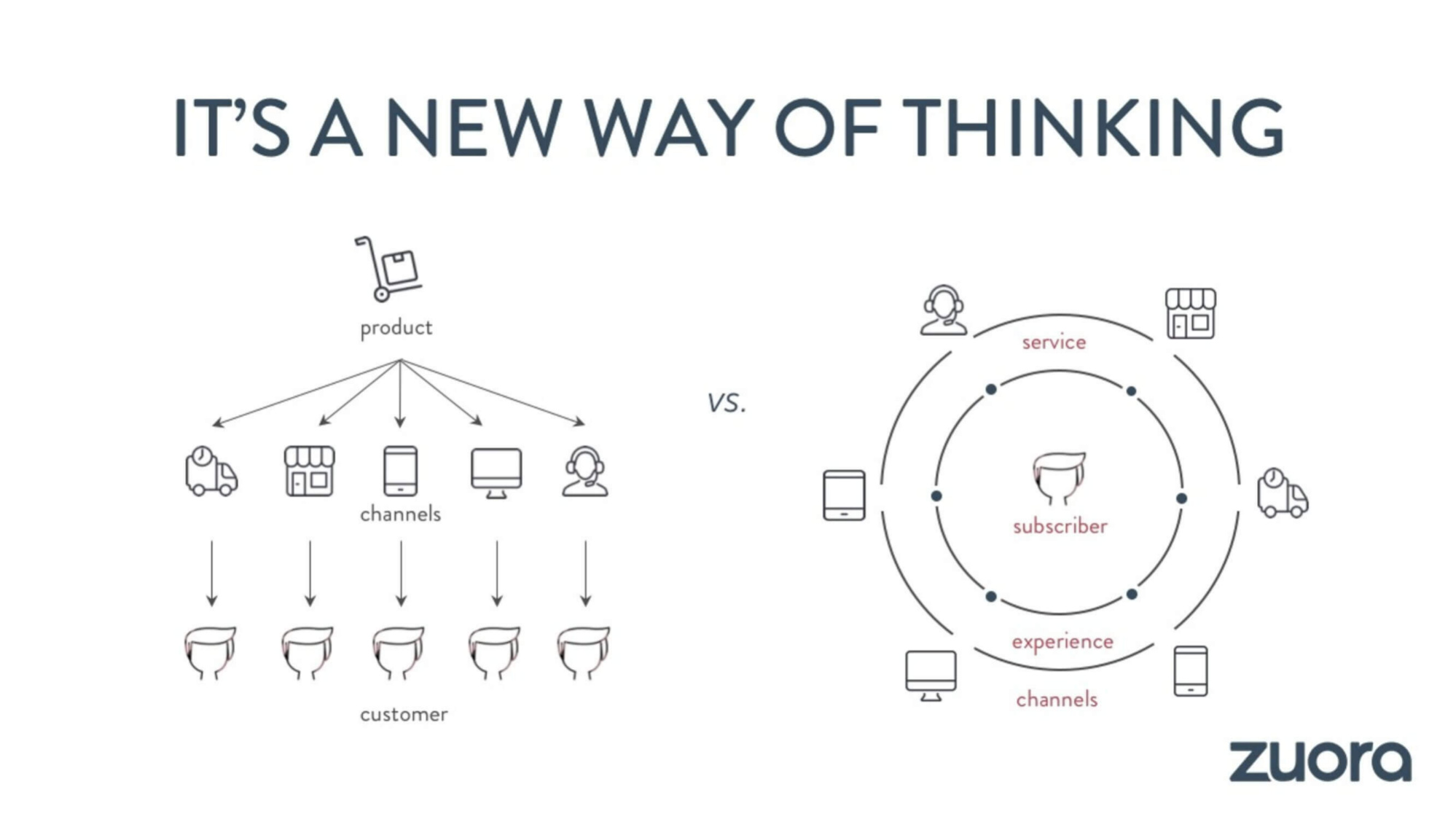
Next up, Zuora provides a comparison of the old, product-centric model and the new, relationship-based experience. By presenting the Promised Land in a more aesthetically-pleasing way, it automatically makes it more enticing to potential customers.

By the time they finish analyzing the slide, they’re already curious about how to reach this new state. Or, at least they should be, if they ever make sense of it.

Zuora best sales deck ever“Promised land” Before-and-After slide

The problem with this slide is that it doesn’t provide much context apart from the odd label. The simplified diagram, somewhat counterintuitively, makes it hard to understand the meaning it tries to convey.

Leaving such an important slide unclear opens the way to individual interpretation and leaves room for confusion, miscommunication, and frustration.

Zuora sales deck improved “Promised land” Before-and-After slide

We took back control of the storyline with the help of our narrator slide. This allows you to add short descriptions to each individual stage and guide readers through your way of thinking.

Also, as most buying decisions involve 7 people on average, it ensures that everyone’s on the same page when your deck travels internally.


8. Including a clear next step

Zuora closes their sales deck with a simple ‘The end’ and a hashtag inspiring readers to start their story.

Zuora best sales deck ever “The end” slide

But, it doesn’t give any direction on how exactly to go about that. Instead of capitalizing on the immense value delivered to the prospects, they’re closing off communication.

Wait, I’m interested, but what do I do next? Do I go back to Zuora’s website to look for their email address or do a quick Google search?

Let’s be honest. When faced with this choice, most prospects will simply close the deck and move on to the next offer.

Creating a sales deck without making the next step clear and actionable is like building a supermarket without a checkout counter. You build up excitement around your solution, prospects are ready to part with their hard-earned money… and there’s no one to give it to.

Best sales deck ever improved “The end” slide

Thanks to various CRM integrations, Storydoc facilitates encouraging and guiding prospects down the funnel. You can include a live chat widget or embed your calendar in your deck, so a potential client can easily find the next available time slot. No more guesswork or inefficient back-and-forth communication.


9. Personalizing the deck

So, you’ve already gone through at least one meeting with the sales team. You’ve shared your main pain points, expectations, and left hopeful that you’re going to receive the perfect solution tailored to your needs.

Then, the sales deck arrives and all excitement is gone. It looks super generic, like you were just one of the hundreds of names on the company’s recipient list.

Have they even listened to what I said? Can they cater to my needs if I’m not even sure they got them right?

Planting a seed of doubt in your prospect’s mind can cost you the deal. We all like to feel special. I mean, when’s the last time you responded to a “Dear User” email?

By adding dynamic variables to Zuora’s sales deck, we made it possible to personalize at scale. You can pull all the necessary information, like a client’s name or logo, straight from the CRM into your deck.

Creating thousands of different versions, each tailored to a specific recipient, will now literally take seconds. The implications are huge.

When you include personal notes in your deck:

  • The number of people who read it in full will increase by 68%
  • The average reading time will be 41% higher.
  • It will travel around internally 2.3x more often.

The more eyes on your deck, the higher your chances of landing that dream client!

Transform your own sales deck from boring to buzzworthy

Want to transform your own deck the way we did Zuora’s? You can have the best deck ever too! Just pick a sales deck template from our extensive library designed for different use cases and let our editor take care of the rest.

No templates found

Alternatively, you can upload your deck and get our storytelling expert’s opinion on how to improve it.

Takeaways

In the ever-changing business world, the content is just 1 of 3 pillars of a successful sales deck. The other 2 are design and delivery.

We can observe this in Zuora’s example, whose “best sales deck ever” had a brilliant content behind it, but the other 2 elements haven’t been moving with the times.

With the help of our storytelling team, we made 4 broad changes to Zuora’s sales deck:

  1. We added interactive slides to give viewers something to play around with and make them feel like they’re in control of the narrative. This will improve user experience and boost engagement.
  2. We split text into more digestible chunks to ensure that no important insights get lost.
  3. We added dynamic variables to make personalization at scale possible.
  4. We made the next step clear and actionable to skyrocket the closing rate.


With all these changes, we brought Zuora’s deck back to its rightful top spot.

And, we can do the same for you! Try Storydoc free to see how we can reach new heights together. Are you in?

Dominika Krukowska

Hi, I'm Dominika, Content Specialist at Storydoc. As a creative professional with experience in fashion, I'm here to show you how to amplify your brand message through the power of storytelling and eye-catching visuals.

Make your best sales deck ever

Try Storydoc for free for 14 days (keep your decks for ever!)