This is a preview of your story

Powered by

Storydoc

Sales and Marketing Presentations Statistics (Updated 2024)

We've analyzed over 100,000 sessions to Storydoc presentations to uncover 10 key data items that should inform your sales and marketing efforts.

Itai Amoza

7 minute read

Sales and marketing presentation stats
Trusted by top companies:
client logo: meta
client logo: RTL
client logo: Yotpo
client logo: NetApp
client logo: healthy.io
client logo: deliverlight

There’s no selling without a presentation. No matter your business model or niche, at some point, you’re going to need to send over your materials for your customer’s team to review. Now, obviously, you’ll find tons of “best practice” articles outlining what you should do to make your presentations stick, the thing is—

So few of those are based on real-life data and hard numbers. And this is what we decided to change. Our data analytics team looked at 100,000+ sessions to Storydoc business presentations. We searched for what makes the most successful decks so successful.

Below, you’ll see 10 key data points we uncovered to help you take your sales and marketing presentation game to the next level.

1. People who bounce from a sales deck usually do so within the first 15 seconds

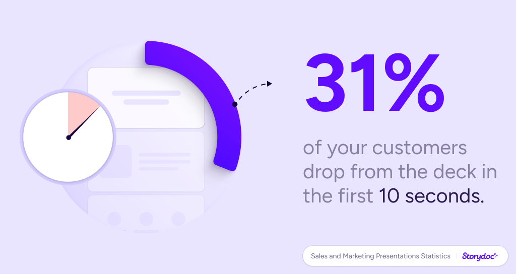
Yes, first impressions really count. Out of the people who “bounce” from a deck (make no interaction whatsoever), most of them do it within the first 15 seconds. How much can you grasp in 15 seconds? Two sentences and one visual, tops.

It all boils down to the catchphrase and the design of the top part of a deck. Apart from the CTA, if there’s one area which you should heavily test it’s just that.

2. The first three slides are key: 80% of readers who go through them, read the deck in full

Sales and marketing presentation statistics

Flipping the script here—

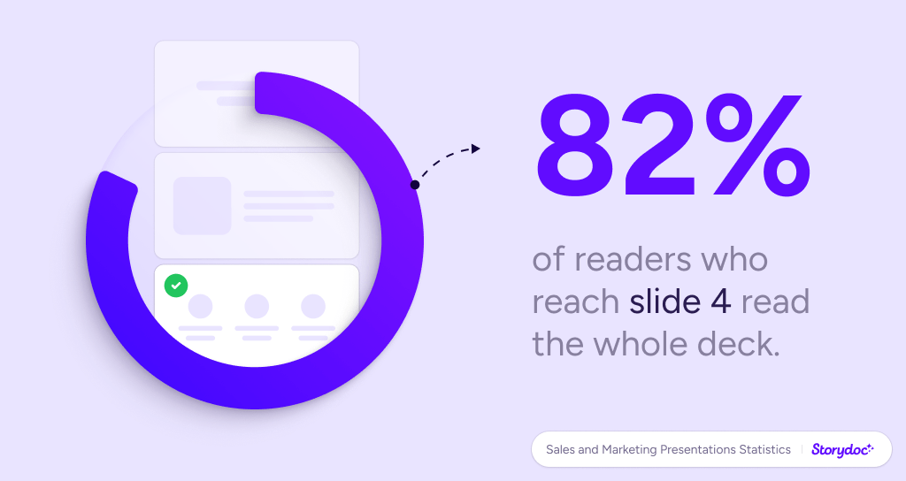
Once you get enough of their attention to stay with you at the beginning of the deck, it becomes extremely likely they’ll stick through until the very end. Four in five readers who go through the first three slides end up reading the deck in full.

The best strategy to keep them engaged for the make-or-break three slides? We recommend adding a second hook in the third slide: something clear and eye-catching, an impressive number, an agonizing problem statement, or a shocking stat.

The key is to take them from casual to engaged readers. See, a recent Gallup report revealed that only 29% of B2B buyers are fully engaged. 60% are indifferent, and 11% disengaged actively. Adding the said “hook” towards the top of your presentation can skew this proportion wildly in your favor.

B2B buyers' engagement with sales presentations, according to Gallup data:

3. Mobile is on the rise: 32% of decks are opened on mobile

Sales and marketing presentation statistics

The world has gone mobile and you know it. I might be stating the obvious here, but it should be one of the key elements of your marketing and sales strategy

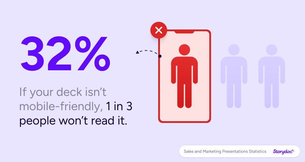
Mobile first. On average, a third of all decks are opened on mobile. If yours doesn’t provide a flawless mobile experience, you’re losing one in three prospects. Make your pages mobile responsive, avoid small fonts and move away from PDFs which auto-adjust to the screen dimensions this becoming unreadable on mobile devices.

Interestingly, the ratio of decks opened on mobile increases the higher you go up the funnel. For instance: 47% of initial outreach decks are viewed on mobile screens compared to only 19% of business proposals.

Mobile views by the type of document:

And that does make sense, right? The further in the deal-closing process you are, the more careful the interaction with your documents will be. But for initial contact, always remember about mobile optimization.

4. Mobile reading time is shorter, but not by much

Also, don’t assume that mobile sessions are “casual.” It’s not like your prospects just give the mobile version a glimpse and decide whether or not to open your deck on desktop later on.

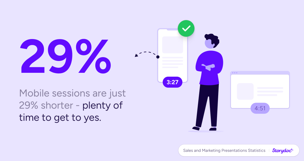
Admittedly, the average reading time on mobile is shorter, but only by 21% (3:41 min on mobile vs. 4:24 on desktop to be precise)—still very much enough time to read into the details and make a decision whether or not to do business with you.

Avg. reading time by device:

5. The first 48 hours are make-or-break

Sales and marketing presentation statistics

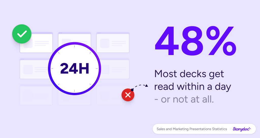
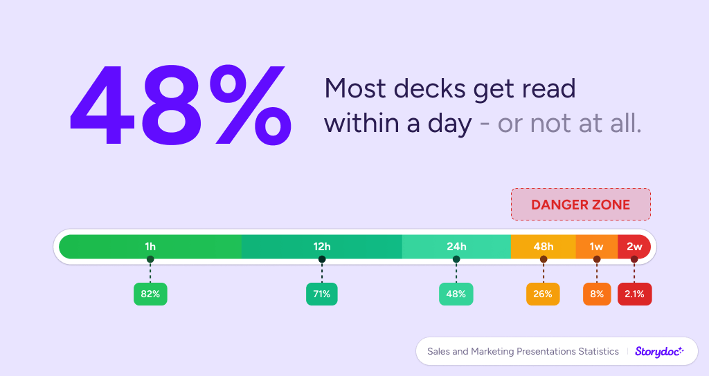
If your prospect hasn’t opened the deck within 48 hours of receiving it, the chance of them reading it at all drops below 20%. The lesson? You guessed it, the follow-up is key! It’s a recurring theme of all sales handbooks and it is so for a very good reason.

According to Invesp’s study, 80% of sales require 5 follow ups. At the same time, almost half (44%) of salespeople give up after their first follow-up contact.

And no, following up does not equal pestering people. If you provide enough value to make them interested, you’re still very much in the running to score that deal.

"80% of sales require 5 follow-up calls whereas 44% of salespeople give up after one follow-up call."

- Source: Invesp -

Invesp logo

6. Personalization is the most important predictor of success

Sales and marketing presentation statistics

When was the last time you replied to a “Dear User” email?

Exactly.

Prospects want to feel special. People can tell “generic” from miles away and, at the same time, it doesn’t take much to make every deck you send feel personal.

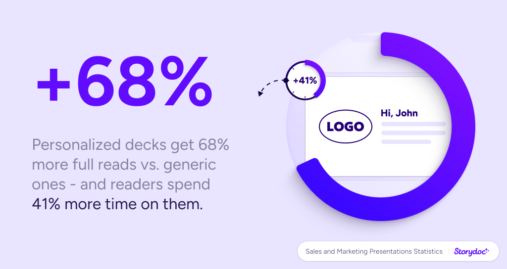
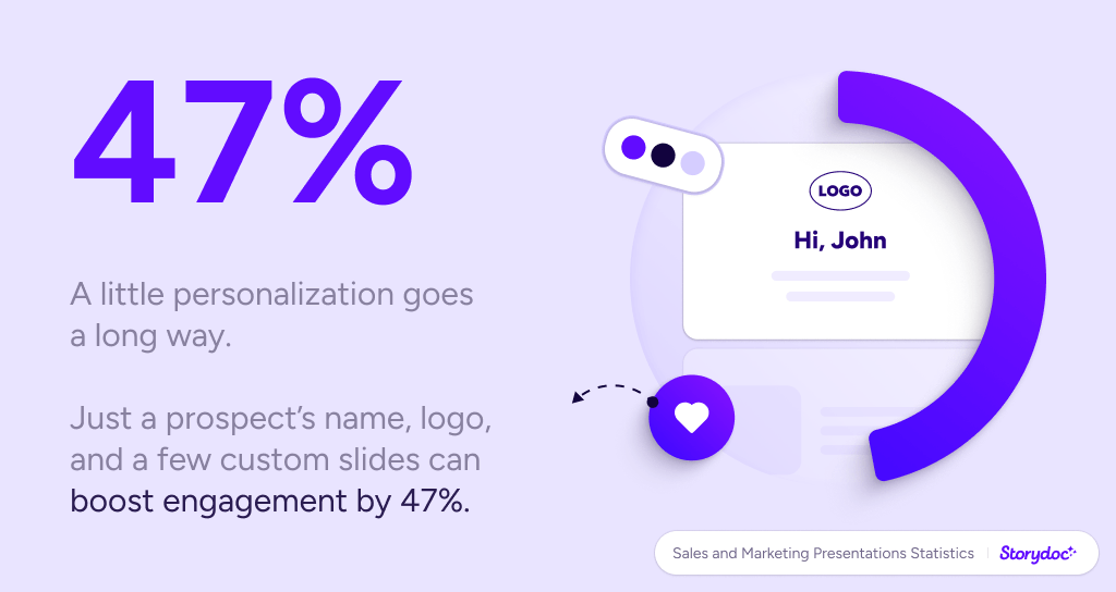
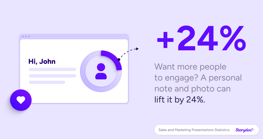
Our analysis found that decks which included a personal note tailored to the recipient got 68% more people read them in full compared to general presentations.

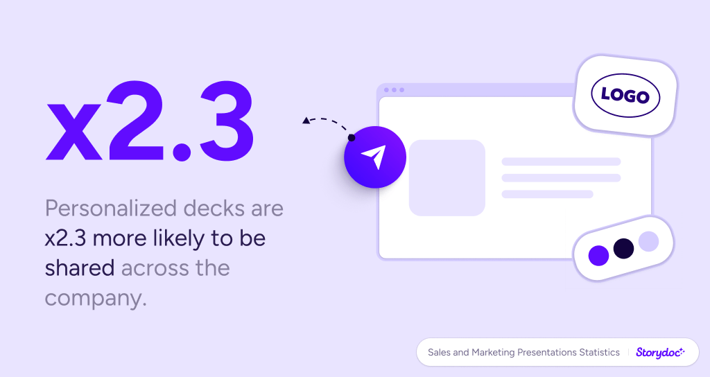
Also, personalized content resulted in a 41% increase in average reading time. Perhaps more importantly, decks customized to a given prospect were shared internally 2.3x more often.

Why does it matter so much? According to Gartner Group’s study, there are between 6 and 10 people involved in a B2B buying decision. Personalizing your decks is a surefire way to reach more of those key decision makers!

Benefits of personalized presentations:

+68%

More decks read in full

+41%

Increased avg. reading time

x2.3

More decks shared internally

7. Conversion rates are higher when the next step is clear

Let’s say the reader liked a deck. They’re interested in the product. They enjoyed the value proposition. The worst thing that can happen now is if they’re not sure what to do.

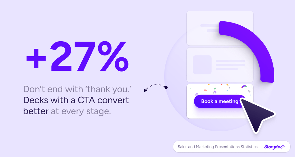
It’s crucial to make the next step easy for them. Out of the decks we analyzed, the ones that contained a singular, clear next step (e.g. book a demo, sign up, leave your email), had a conversion rate +27% higher than ones which would just leave the generic “thank you” hanging at the end.


Impact of adding next steps on avg. deck conversion rate for a demo call:

8. Letting readers "play around" with the presentation increases engagement

Sure, dynamic content such as moving slides or videos can work wonders (more on that later), but it’s best to let customers play around with a deck.

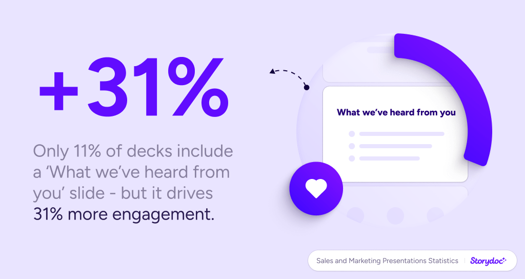
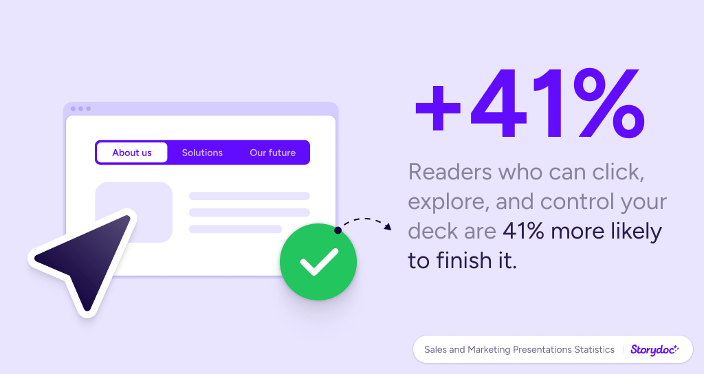
When comparing decks with interactive elements (for instance, tabs to click through and see different benefits of a product, live data calculators, sliders with case studies or customer testimonials) to the ones that can “only” be read, we found that the former would get scrolled to the bottom 41% more often and make for a 21% longer average reading time.

Why is it so important? It creates active engagement, and lets customers feel a degree of control over the content they’re reading. It makes them protagonists of the story, not just passive listeners.

Speaking of “stories”... sure, it’s a major buzzword in today’s sales but for a good reason. Sales Hacker’s data show that prospects remember only up to 10% of numbers and around 25% of images they see. If your message is centered around a story, this number rises to 60–70%!

"Prospects remember only up to 10% of numbers and around 25% of images they see. If your message is centered around a story, this number rises to 60–70%!"

- Source: Sales Hacker -

analytics_default

9. Videos are critical

Sales and marketing presentation statistics

The first impression your deck makes will make or break a deal. It’s brutal but it’s true. We’ll talk about it more in-depth later on, but for now, a simple trick to help you make a better first impression: video.

Presentations that included a video in their cover slide had 32% more people interacting with them compared to those with a static cover background. And the difference doesn’t only refer to the top part of the deck:

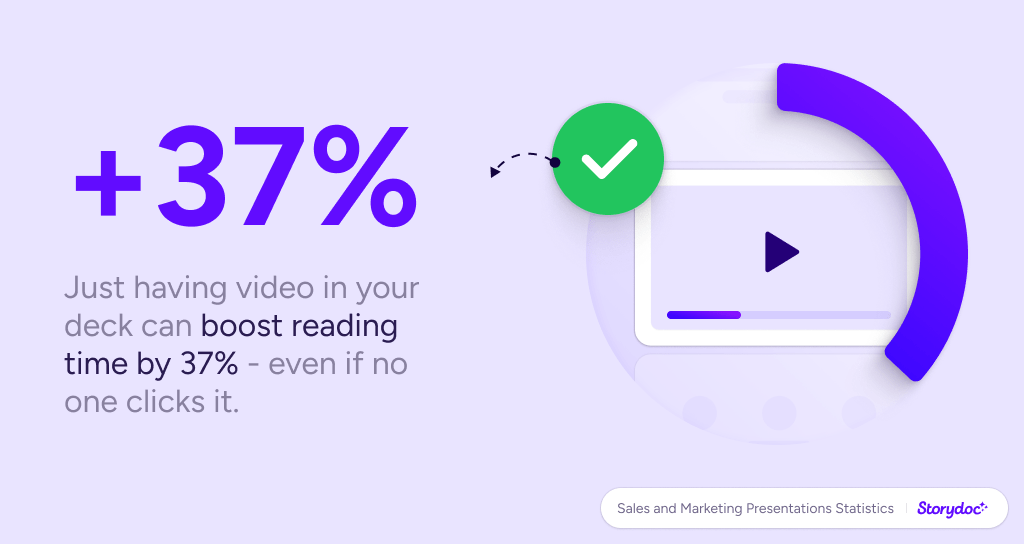
Amongst the presentations analyzed, those with *any* video embedded enjoyed a 37% longer average reading time and a 17% increase in the CTA click-through rate.

(All this despite the fact that only 23% of readers click to watch the embedded video. Apparently, the sheer existence of video material legitimizes your deck and makes you more likely to be taken seriously).

When it comes to actual sales, CustomShow data indicates that a video included in your presentation makes customers 85% more likely to purchase your product or service. Wow, right?

Benefits of adding a video:

+32%

Higher engagement

+37%

Longer reading time

+17%

Higher CTA click-through rate

10. Lowest-hanging fruit? Information on the average reading time

Ever wondered why major online media outlets have the “Average reading time” blurb at the top of their articles?

I’ll give you a hint: they tested the hell out of it and they know it works.

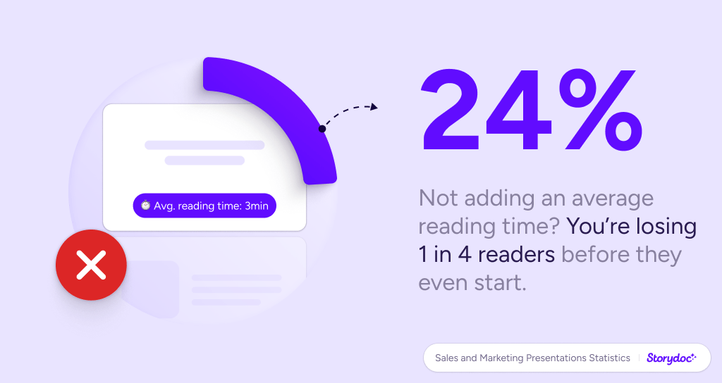
Why would it be any different with sales and marketing decks? We found that adding a piece of information about the estimated reading time of your whole deck will make the number of people who bounce immediately shrink by 24%.

That’s right. These three words can make a quarter more people start reading!

24%

Lower bounce rate when adding avg. reading time

And that’s it from us for now!

Want to share our findings? Go for it! All images, animations, and items of data featured in this study are available for non-commercial reuse. Please, make sure to reference the source and link back to this page to give the authors proper credit.

And, of course, stay tuned for more fresh data coming up. Sales should be guided by knowledge, not guesswork!

Methodology and limitations

Our study is based on the analysis of readers’ behavior across over 100,000 reading sessions of presentations created with Storydoc. We only included live versions of the Storydoc pages in the analysis: all the data comes from real sales and marketing presentations our customers sent to their audiences.

Unless clearly stated otherwise, the comparisons made in this analysis are based on the data for all presentations featuring a certain element versus all those without it (e.g. all presentations with a video in their cover slide vs. all presentations with a static cover).

For the data regarding the reading time, upper outliers have been removed from the analysis so that accidental reading sessions of a few hours don’t skew the averages.

The presentations analyzed in this study were used across many different industries, organization sizes, and use cases. Considering the size of our sample, the data can be generalized to all kinds of marketing and sales presentations.

Itai Amoza

Hi, I'm Itai, one of Storydoc's co-founders. As a data geek, I couldn't hold myself from jumping into our data and discovering what makes top-performing sales decks so successful. I'm excited by the opportunity to share our findings and contribute to the sales and marketing community!

Make your best pitch deck to date

Try Storydoc for free for 14 days (keep your decks for ever!)