This is a preview of your story

Powered by

Storydoc

8 One-Pager Design Ideas and What Makes Them Outstanding

Learn how to design a one-pager that immediately grabs attention. Explore one-pager design ideas and examples with effective structure, layout, and format.

Dominika Krukowska

7 minute read

One-pager design
Trusted by top companies:
client logo: meta
client logo: RTL
client logo: Yotpo
client logo: NetApp
client logo: healthy.io
client logo: deliverlight

Short answer

How to design an attention-grabbing one-pager?

  1. Give your one-pager title slide a strong visual hook (video or animation)
  2. Use interactive content like live graphs, calculators, and embedded apps
  3. Design for storytelling using narrated design (scrollytelling)
  4. Replace complex texts with multimedia
  5. Show your product or service in action

Remember, an engaging one-pager is like an elevator pitch in written form, capturing readers with its story.

You only have 15 seconds to get people’s attention - make them count

Designing a one-pager is a bit like preparing for a crucial elevator pitch to a potential investor. You have a wealth of information, but only a fleeting moment to convey the main idea.

The challenge? Succeeding in standing out, grabbing attention, and using it to drive your point home.

A one-pager is your quick spotlight moment, your brief handshake, your chance to leave a lasting impression.

But, if your one-pager design fails to stand out, your effort will simply drown in a sea of sameness. And trust me, in a world bursting with competing information, it’s all too easy for your message to be overlooked.

This guide will teach you how to balance brevity with impact, ensuring your one-pager is both concise and compelling. You’ll also get one-pager design ideas and examples, so you can create your own in no time.

Let’s get started!

What is the main challenge in one-pager design?

The key challenge in one-pager design is balancing brevity with impact as studies show that a poorly designed website with irrelevant information can drive away as many as 38% of users. Designers must ensure visuals and text work harmoniously, capturing the essence without overwhelming the viewer. It's about making limited space visually compelling and informative.

What is the best one-pager file format?

While PDFs or PNGs are the go-to for many, interactive web-based formats truly shine for one-pagers. They offer a lively experience, allowing readers to click, explore, and connect with your content on a deeper level.

Interactive designs capture attention and make your message memorable.

Here’s an example of static and interactive content side by side - which would you prefer?

Static PDF or PPT
Interactive Storydoc

What is the best one-pager design layout?

Choosing the right layout for your one-pager determines how your content will be received and interacted with. Let's explore the options:

  • PDF: These can be tricky. Overloaded with text and visuals, they often become challenging to navigate and digest.

  • 16:9 slide format: While popular, this format can feel limiting. The space constraints often lead to generic and overloaded designs.

  • Word doc: Functional, but often seen as unexciting. They lack the visual dynamism that captures attention.

  • Scroll-based web page format: A standout choice. This format aligns with the browsing habits of today's digital audience. It allows for focused reading, complemented by high-resolution visuals and videos that truly engage the viewer.

If you seek a user-friendly and straightforward method to craft a landing page, Hostinger may be a reliable option. Equipped with numerous AI tools, it streamlines the process of launching a web-based one-pager to just a few clicks away from going live.

How do you structure a one-pager design?

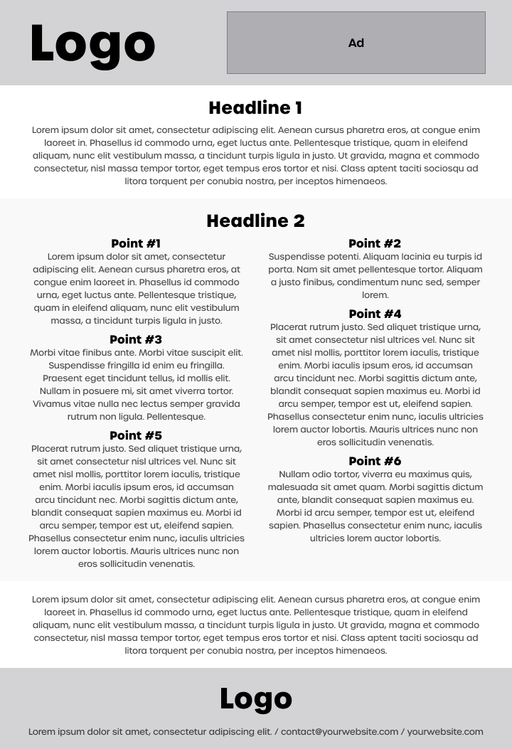
The traditional one-pager structure is simply an A4 page stacked with densely packed text. In some cases, it also includes tables and graphs. It’s a scary thing to look at and it does not invite reading. In business that’s sometimes how things are.

But there’s a new and better way to structure your one-pager so that it will invite engagement, facilitate understanding, and enable decision-making.

Here’s how traditional one-pagers are structured:

Bad one-pager design

The way to structure your one-pager to grab attention and engage your reader is to break the traditional A4 PDF format and transition to using a web-based one-pager that relies on scrolling to navigate the content.


Scroll-based design gives you more freedom of structure:

  • You can spread out the text on multiple screens and make it less daunting

  • You can place images or videos side by side with the text to communicate more deeply

  • You can use accordion elements to hide and expose additional information (to reduce textual load)

  • You can structure parts of your one-pager (as specific slides) to best serve your content rather than commit to the same structure throughout the document.


Here’s an example of what a modern interactive one-pager looks like:

How to design a one-pager for storytelling?

Designing with storytelling in mind is all about guiding the reader's eye and emotions. Here's how to do it right:

  1. Visual entry point: Start with a compelling image or headline that sets the tone. Think of it as your story's "hook."

  2. Flow & hierarchy: Use design elements like color and typography to differentiate between the problem, solution, and vision. This helps guide the reader's journey.

  3. Imagery & icons: Incorporate visuals that resonate with each section. For instance, a lightbulb for the solution or a roadmap illustration for the journey.

  4. White space: Give your story room to breathe. White space ensures your narrative doesn't feel cramped and allows for better readability.

  5. Strong conclusion: Engage your audience with an interactive last slide. Consider adding a personal video, a calendar for scheduling, a signup button for subscriptions, generate a QR code for quick access, or create a survey to gather feedback.

One-pager design best practices

Designing a one-pager is all about creating a visual journey that guides the readers from start to finish. It's a blend of art and strategy, ensuring that each design element serves a purpose and enhances the overall narrative.

Let's dive deeper into the design essentials that can elevate your one-pager:


1) Use a video on the cover

Starting with a video can be a game-changer. It sets the tone and immediately captures attention, offering a dynamic introduction to your content.

Here's an example of a deck with a video on the cover:

2) Use high-quality visuals

Think of your visuals as the landmarks on your journey. Crisp, relevant images not only beautify the page but also reinforce the message, making it stick in the reader's mind.


3) Personalize your one-pager visuals

Personalization goes a long way. Tailoring your one-pager to the reader, perhaps by incorporating their branding, can lead to a 68% higher full-read rate. It's like receiving a hand-written note in a world of generic emails.

Here's an example of a personalized one-pager:

4) Visualize your data

Turn numbers into narratives. Using graphs, charts, and infographics, you can present complex data in an engaging and easily digestible manner.

Here's an example of interactive data visualization elements:

Interactive data visualization slide

5) Use interactive elements

Interactivity turns passive readers into active participants. Elements like tabs or live calculators invite exploration, making the content more engaging and memorable.

Here's an example of an interactive slide:

Interactive slide

6) Use narrated design - scrollytelling

With narrated design, readers can explore the content at their own pace, ensuring they connect with each segment. This approach can achieve retention rates of 60-70%, making your message resonate and linger.

Here's an example of Storydoc scrollytelling:

Narrator slide example

7) Segment your content in tabs to save space

When it comes to one-pagers, space is a premium. Using tabs to segment content is a clever design trick, allowing for depth without overwhelming the layout. It's a neat way to organize while keeping the flow.

Here's what tabbed content looks like:

Tabbed content

8) Tuck extra text under a ‘read more’ button

When space is tight, a 'read more' button is a great addition. It lets you offer extra insights without crowding the main content. It's like having a little secret drawer filled with bonus goodies for the curious.

Here's what it looks like:

Interactive slide with read more button

9) Link to external content / supporting documents

Another nifty trick when space is limited is to link to external content or supporting documents. It adds depth and credibility without taking up precious real estate on your one-pager.


10) End with a clear CTA

Every journey needs a destination. A clear call to action at the conclusion provides direction, guiding readers on their next steps after the journey you've taken them on.

Here's an example of a next steps slide:

Last slide of presentation

One-pager design mistakes to avoid

Designing a one-pager is all about striking the right balance. You want it to be informative yet concise, eye-catching but not overwhelming. Let's dive into some common design pitfalls you'll want to avoid:


1) Overloading slides

It's easy to want to pack in all the details, but too much can make your one-pager feel crowded. Aim for a clean layout where each piece of info has room to breathe.


2) Using too many visuals

While visuals are great for breaking up text and adding flair, using too many can clutter your design. Choose a few impactful images or graphics that enhance your content.


3) Not designing one-pagers for mobile viewing

Many folks will view your one-pager on their phones. If it's not mobile-friendly, you risk alienating a big chunk of your audience. It's like sending out invitations in a font so tiny, half your guests can't read them.


4) Using traditional PDF or PPT design formats

Traditional PDFs or PPTs might feel familiar, but they're not always the best choice for one-pagers. Requiring readers to pinch and zoom is a surefire way to frustrate them. Think of it as handing someone a magnifying glass to read a menu. Not ideal, right?

Professional one-pager design ideas to inspire your own

Crafting an attention-grabbing one-pager is a bit like telling a captivating story in a short amount of time. It's all about blending bold visuals with a clear, concise narrative.

Think of it as your written elevator pitch: short, impactful, and leaving your readers eager for more.

Let’s explore some one-pager design ideas to guide your efforts:

Sales one-pager design

Think of this design as your digital sales toolkit. With intuitive tabbed content, it's a breeze to navigate.

The data visualization elements translate numbers into compelling stories, while image and video placeholders are all set to bring your sales narrative to life, making sure your pitch isn't just heard—it's experienced.

Social media one-pager design

Dive into this design that's bursting with vibrant shades of pink and sea blue, capturing the essence of the social media vibe. The dataviz slides turn complex data into visual treats, while the timeline slide maps out your journey in style.

And the tabbed content? It's your passport to organized and engaging information, ensuring your audience stays hooked from start to finish.

General business one-pager design

This design truly gets what business is all about. With a harmonious blend of visuals and text, it showcases your business proposition with clarity and flair.

And its adaptability? It's ready to champion any business idea you throw its way.

Physical product one-pager design

Showcase your product with a design that puts it center stage. High-quality imagery combined with concise descriptions ensures your product shines.

The layout is crafted to guide the viewer's attention, highlighting the product's features and benefits seamlessly.

Real estate one-pager design

Imagine a design that's like a warm welcome into a grand residence. That's what we have here. Spacious layouts, sophisticated colors, and top-notch typography make sure your properties get the red-carpet treatment they deserve.

Marketing one-pager design

Ready to make some marketing magic? This design is your wand. With its scroll-based layout, hints of sophisticated purple, and a blend of interactive elements, it's all about engaging your audience in the most stylish way.

Modern one-pager design

This modern design strikes a perfect balance between style and clarity. The generous white space and subtle tones set a relaxed mood, while that hint of blue adds a touch of modern flair.

It's a nod to today's design trends while ensuring your message is both approachable and professional.

Simple one-pager design

Less is more with this elegantly simple design. Clean lines, muted colors, and straightforward typography ensure your content speaks for itself.

It's a design that's both understated and effective, perfect for those looking to convey their message without any fuss.

One-pager design templates that grab attention

Designing a one-pager that stands out is about blending compelling content with striking visuals. But, let's be honest, not everyone has the time or expertise to craft that perfect design from scratch.

That’s why I’ve handpicked a gallery of interactive one-pager templates that are designed with best practices in mind and tailored for impact. They’re your express ticket to a standout design without the usual hurdles.

Grab one.

No templates found
Dominika Krukowska

Hi, I'm Dominika, Content Specialist at Storydoc. As a creative professional with experience in fashion, I'm here to show you how to amplify your brand message through the power of storytelling and eye-catching visuals.

Grab a one-pager template

Create your best one-pager to date

Try Storydoc interactive one-pager creator for 14 days free (keep any presentation you make forever!)