Netflix Pitch Deck Inspired Remake (Usable as Template)

Explore our interactive Netflix pitch deck template based on the original pitch and culture decks. Get tips on how to make your own pitch deck to succeed.

Netflix pitch deck

helped business
professionals at:

Nice Meta RTL Spot Xerox Pepsi

Short answer

What makes an effective pitch deck?

An effective pitch deck grabs investors’ attention right away with a story that stands out and clearly shows its market promise.

It uses crisp, appealing visuals that enhance a well-organized narrative, making sure every slide effectively communicates the business’s unique value and model.

These days, you need more than a good idea to win funding

In its early days, Netflix really stirred things up with its DVD mail service, but it wasn’t all smooth sailing.

They had to contend with giants like Blockbuster and Amazon and continued to face challenges even after their initial public offering.

The initial pitch wasn’t your typical deck but a casual, yet impactful email to tech journalist Harry McCracken in 2001.

Inspired by Netflix’s straightforward style, we at Storydoc have given that pitch a modern twist, turning it into an interactive deck.

In a world where time is short and most pitches are seen on mobile screens, capturing attention quickly is key. Our interactive remake is designed to make a strong impression right off the bat.


Here’s the email that started it all:

Here's how something called "NetFlix"--like Kozmo for Blockbuster!--was pitched to me in 2001, after I apparently ignored a call about it. pic.twitter.com/B3ODp9Zcj1

— Harry McCracken 🇺🇦✡️ (@harrymccracken) October 15, 2017

How we reimagined the Netflix pitch deck

In this section, I’ll guide you through our Netflix investor pitch deck, one slide at a time.

I’ll explain how we organized it with a clear problem-solution approach and made it visually appealing. I’ll also give you some tips on what makes a pitch deck successful and how you can use these strategies in your own presentations.


If you want to see the full deck first, here it is:

1) Cover slide

On the cover slide, we've placed the Netflix logo at the top. We used our handy logo finder tool to make sure it looks sharp and fits well with the slide’s design.

Here’s the cool part: we've included video clips from various Netflix shows right on this slide. It’s all about "show, don't tell"—letting potential investors see what Netflix is really about.

Plus, starting with a video can increase engagement by up to 32% right off the bat. It's a great way to capture attention and keep viewers hooked.


Here's the cover slide:

Netflix pitch deck cover slide example

2) Unique Value Proposition

Moving on to the next slide, we highlight Netflix’s unique value proposition: "Unlimited movies, TV shows, and more. Watch anywhere. Cancel anytime." Simple and compelling, right?

We’ve placed this message front and center to quickly demonstrate what Netflix offers.

It’s not just about the sheer amount of content; it’s also about the freedom to enjoy it wherever you wish, on your own terms, without being locked into a long-term contract.

This slide is designed to resonate with everyone by illustrating the flexibility and variety Netflix brings to your life, making it an attractive choice.


The Unique Value Proposition slide:

Netflix pitch deck Unique Value Proposition slide

3) Problem

On the Problem slide, we talk about what used to be wrong with the way we usually got our entertainment before Netflix. It’s pretty clear: the old system hadn’t changed in ages, and that was tough for viewers who faced limited choices.

We zero in on 2 big problems here: first, there was no one place where you could find all kinds of movies and TV shows. Second, finding a platform that offered a wide range of genres all in one spot was really hard.

By clearly highlighting these problems, we point out how Netflix changed the game. It makes it obvious why a better option was needed.

This slide is all about making you see these issues as your own, leading to that “aha” moment when you think, “That’s exactly what’s been bugging me!”


Here's the problem slide:

Netflix pitch deck problem slide example

4) Solution

After tackling the common frustrations on the "Problem" slide, we shift to the "Solution" slide, where we introduce how Netflix addressed these issues.

Here's the fix: Netflix offers a smooth streaming experience that meets the needs of today's viewers. It's all about easy access, personalization, and enjoying your favorite shows and movies without those annoying ads.

This slide highlights how Netflix changed the game. It provides a straightforward, easy-to-use platform where you can find all sorts of genres in one place. No need to jump from one service to another—it's all here.

By emphasizing these points, it's clear how Netflix stood out as a revolutionary solution in a market that had been crying out for change.


Here's what the solution slide looks like:

Netflix pitch deck solution slide example

5) Key features

Following up on our solution slide, we break down what makes Netflix a great choice.

We keep it simple and fun by highlighting 3 major features that set the Netflix experience apart back in the day: personalized content, on-demand streaming, and ad-free viewing.

Each feature is paired with a GIF from a Netflix show, making each point informative but also engaging and a bit more memorable.

This makes it easy for readers to see the value Netflix brings without getting bogged down by technical details.


Key features slide:

Netflix pitch deck key features slide example

6) Mission statement

This slide isn't just about outlining Netflix’s goals—it’s interactive and designed to clearly demonstrate where Netflix is headed and their strategy to get there.


Here's a quick look at the 4 key sections:

  1. Growth tracker: We've included a live data visualization in one quadrant that shows Netflix’s progress toward becoming the top OTT platform. It updates in real time, giving you the latest stats and a clear picture of their progress.

  2. Viewer interaction: Another quadrant has an interactive element where we ask, "Have you subscribed to Netflix?" This keeps the presentation lively and engaging, and the question can be changed to suit different audiences or to get specific feedback.

  3. Our mission: Right in the center, the mission statement is straightforward: "To grow our organization’s streaming service and our subscriptions globally and domestically." It's all about getting Netflix into more homes worldwide.

  4. Focus points: We highlight the main goals here: making Netflix a global product and the most used OTT platform. These points guide Netflix’s efforts and show their commitment to reaching every corner of the globe.


Here's the mission statement slide:

Netflix pitch deck mission statement slide example

7) Timeline

Next up, let’s take a stroll through Netflix’s history with our interactive timeline slide. This one’s designed to guide you from the very start of Netflix at the end of the 90s right up to today.

The timeline uses grayed-out content. As you scroll through, each milestone pops up, making it easy to focus on and understand the key events one at a time. It’s a great way to see just how much Netflix has grown and evolved over the years.

From the first DVD shipment to launching their streaming service and expanding globally, each step on the timeline highlights a major leap forward in Netflix’s journey. It’s about sharing their story in a way that’s engaging and easy to follow.


Here's the timeline slide:

Netflix pitch deck timeline slide example

8) Revenue model

The next slide explores Netflix's revenue model and the different pricing options for subscribers.

We've included an interactive chart that tracks Netflix's growth over the years. This visual helps illustrate the impact of their strategic decisions, providing a clearer understanding of their approach without diving too deep into specifics.


Revenue model slide:

Netflix pitch deck revenue model slide example

9) Competition

Now, let’s see how Netflix compares to the competition. On this slide, we show the logos of Amazon Prime and Hulu, along with a comparison of their pricing models and what sets them apart from Netflix.

This comparison goes beyond just pricing; it highlights the unique features and benefits that each service offers.

By presenting this information, we help you understand why someone might choose one service over another and where Netflix really stands out.

Below the main comparison, there’s a FAQ section. This part uses expandable text to include all the common questions without making the slide too busy.

Just click on a question, and the answer pops up, keeping everything clean and easy to follow.

This setup makes it simple to grasp the competitive landscape and see how Netflix continues to innovate and remain a top choice among streaming services.


Here's our competition slide:

Netflix pitch deck competition slide example

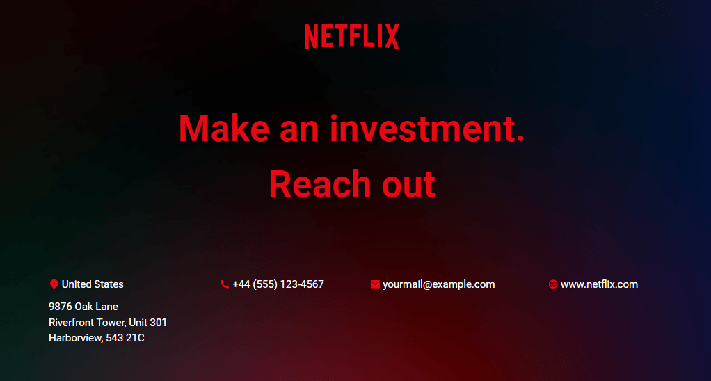
10) Next steps slide

Alright, what comes after the investors have seen all the cool stuff Netflix has to offer? Our next steps slide makes it super clear what we’d love for them to do next.

We include all the necessary contact details right here, so readers don’t have to go searching.

Even better, you can embed a calendar link. This way, if someone wants to chat more or get some questions answered, they can book a meeting right away, right from the slide. It’s all about making that next step as easy as possible.

And here’s a neat little fact: when you give a clear, single action for people to take next, it can boost your conversion rate by 27%.


Here's our next steps slide:

Netflix pitch deck next steps slide example

How to create a pitch deck like Netflix

To make a pitch deck as captivating as Netflix's when they started, begin by pinpointing the problem your startup wants to solve.

Describe your unique solution and emphasize how it could shake up the market and what sets it apart from the competition.

Keep your visuals clear and engaging. Organize your slides so that your main points stand out to investors who might not be familiar with your industry or have to sift through dozens of similar-looking decks.

For more tips, take a look at our articles on how to write a fundable pitch deck and how to make a pitch deck.

Or, if you’re looking to pitch your show, we’ve got a dedicated guide on how to pitch a show to Netflix too!

Interactive pitch deck templates

Creating your own pitch deck can be nerve-wracking, as there’s so much riding on this one document and you only have 15 seconds to impress investors.

Interactive pitch deck templates have been optimized for engaging potential investors. They’re built with all the pitch deck best practices in mind, so you can rest assured that they work.

Just grab one and transform your own pitch deck.

No templates found
Dominika Krukowska

Hi, I'm Dominika, Content Specialist at Storydoc. As a creative professional with experience in fashion, I'm here to show you how to amplify your brand message through the power of storytelling and eye-catching visuals.

Engaging decks. Made easy

Create your best pitch deck to date.

Stop losing opportunities to ineffective presentations.
Your new amazing deck is one click away!