Netflix Culture Deck Made Better (Usable as Template)

Discover how our team enhanced the original Netflix culture deck, now a customizable template, and learn how you can apply the same rules to your own deck.

Netflix culture deck example

helped business
professionals at:

Nice Meta RTL Spot Xerox Pepsi

Short answer

What makes the original Netflix culture deck so effective?

The original Netflix culture deck shines due to its clarity, emphasis on freedom and responsibility, and its focus on fostering a culture of innovation. It encourages transparency, empowering employees to contribute their best work.

The original Netflix culture deck deserves a visual update

When it first hit the scene back in 2009, the Netflix culture deck changed the game, inspiring businesses everywhere to rethink their approach to teamwork, innovation, and leadership.

Its straightforward, no-nonsense principles on transparency, accountability, and high performance became a blueprint for building a culture that truly drives success.

Yet, as groundbreaking as it was, the deck's visual style and format haven't kept pace with the times. Today's audiences expect sleek, engaging presentations that capture attention and communicate ideas clearly and effectively.

In this blog post, I’m excited to share how we've updated the Netflix culture deck. Our goal was to ensure that its pioneering concepts are presented in a way that speaks to the modern viewer.

Here's a quick look at how we've transformed the original deck (left) into its updated, visually appealing version (right):

Static Netflix culture deck
Interactive Storydoc

Attracting top talent requires a top-notch culture deck

Think back to a time when the idea of binge-watching your favorite series anytime, anywhere seemed like a distant dream.

Netflix turned that dream into reality, not just by changing how we watch TV, but by building a culture that attracts and nurtures top-notch talent.

The Netflix culture deck became a blueprint for modern corporate culture, emphasizing values like freedom, responsibility, and a relentless pursuit of excellence.

But in today's world, where the battle for the best and brightest is fiercer than ever, having a cool mission statement on your website isn't enough. You've got to show potential team members exactly how your values shape your daily work life and why they matter.

Patty McCord, the architect behind the original Netflix culture deck, famously said, "The actual company values, as opposed to the nice-sounding values, are shown by who gets rewarded, promoted, or let go."

Just like Netflix made it super easy for us to get lost in show after show, their culture deck needs to do something similar: it needs to grab your attention and pull you in.

By making their culture deck interactive, we wanted to show how these values come to life within the company.

We framed it around a story that’s an open invitation to see if you're a fit for their world, and stays with potential hires long after they’ve closed the presentation.


Netflix culture deck (interactive remake):

Disclaimer: The observations shared here draw from Netflix's original culture deck, publicly available on this link. It has been recreated by our team solely for illustrative purposes and does not represent the actual deck used by Netflix in their recruitment process.

How we improved the original Netflix culture deck

Let's explore how we've taken Netflix's original culture deck and made it even better.

We've refined its core message and injected some interactivity, creating a step-by-step breakdown of the changes that elevate a solid culture deck into something exceptional.

I'm here to guide you through these updates, sharing tips on how to sprinkle a bit of this magic into your own deck to capture the attention of potential hires and make them want to become a part of your vision.


1) Cover slide

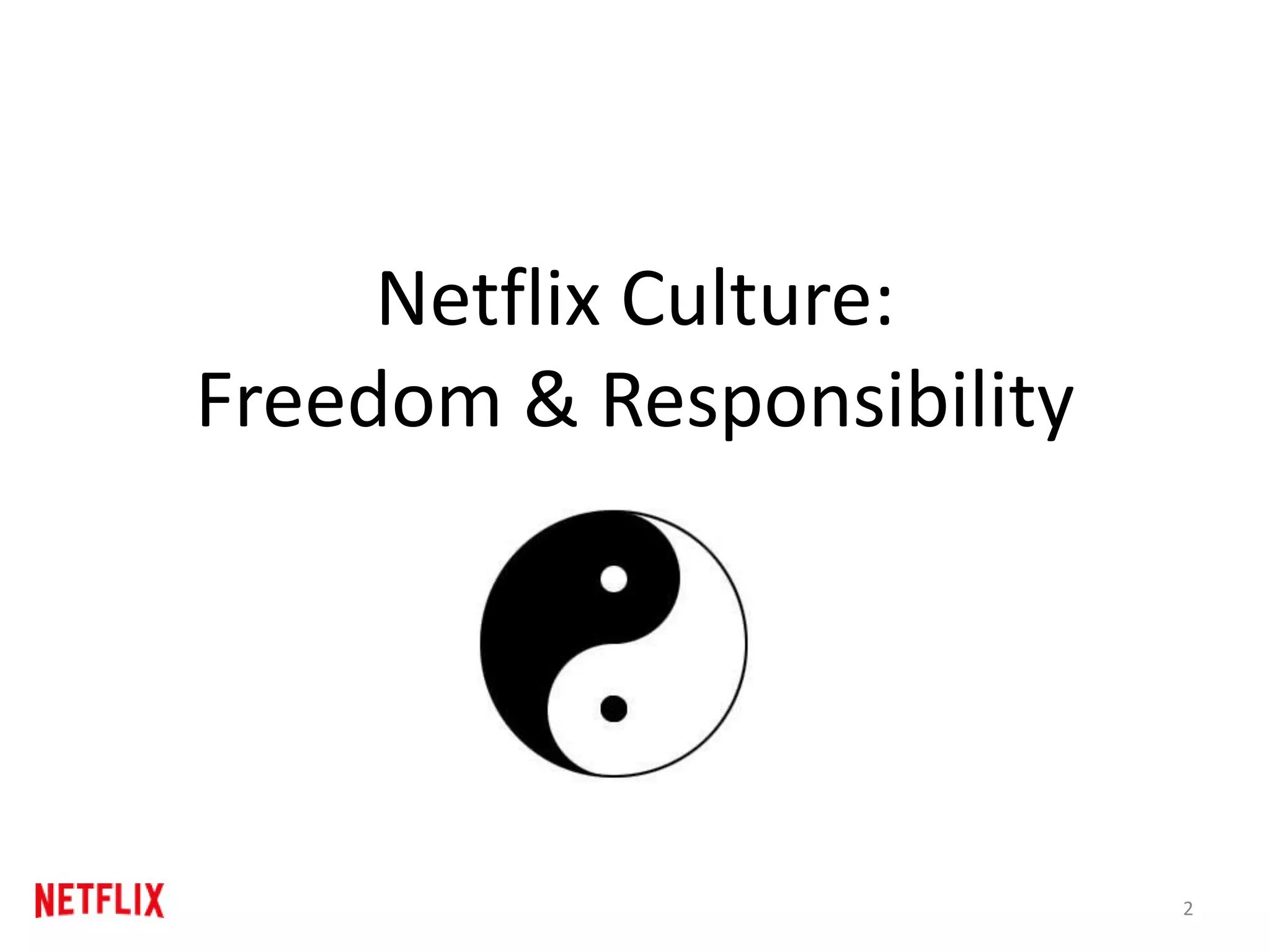
On the original Netflix culture deck, you're greeted with a simple title, "Netflix Culture: Freedom & Responsibility," alongside a ying-yang symbol.

Original Netflix culture deck cover slide

We decided to give this opening a bit of a facelift. Now, the Netflix logo shines front and center, thanks to our handy logo finder tool, adding a touch of brand recognition right from the start.

We've also added a video to the cover slide, featuring clips from various Netflix shows and movies. Our research shows that decks with a video on the first slide engage 32% more viewers than those without.

Interactive Netflix culture deck cover slide

This tweak isn't just about looking good; it's about immediately drawing people in and giving them a taste of the creativity and energy that defines Netflix.

2) Executive summary slides

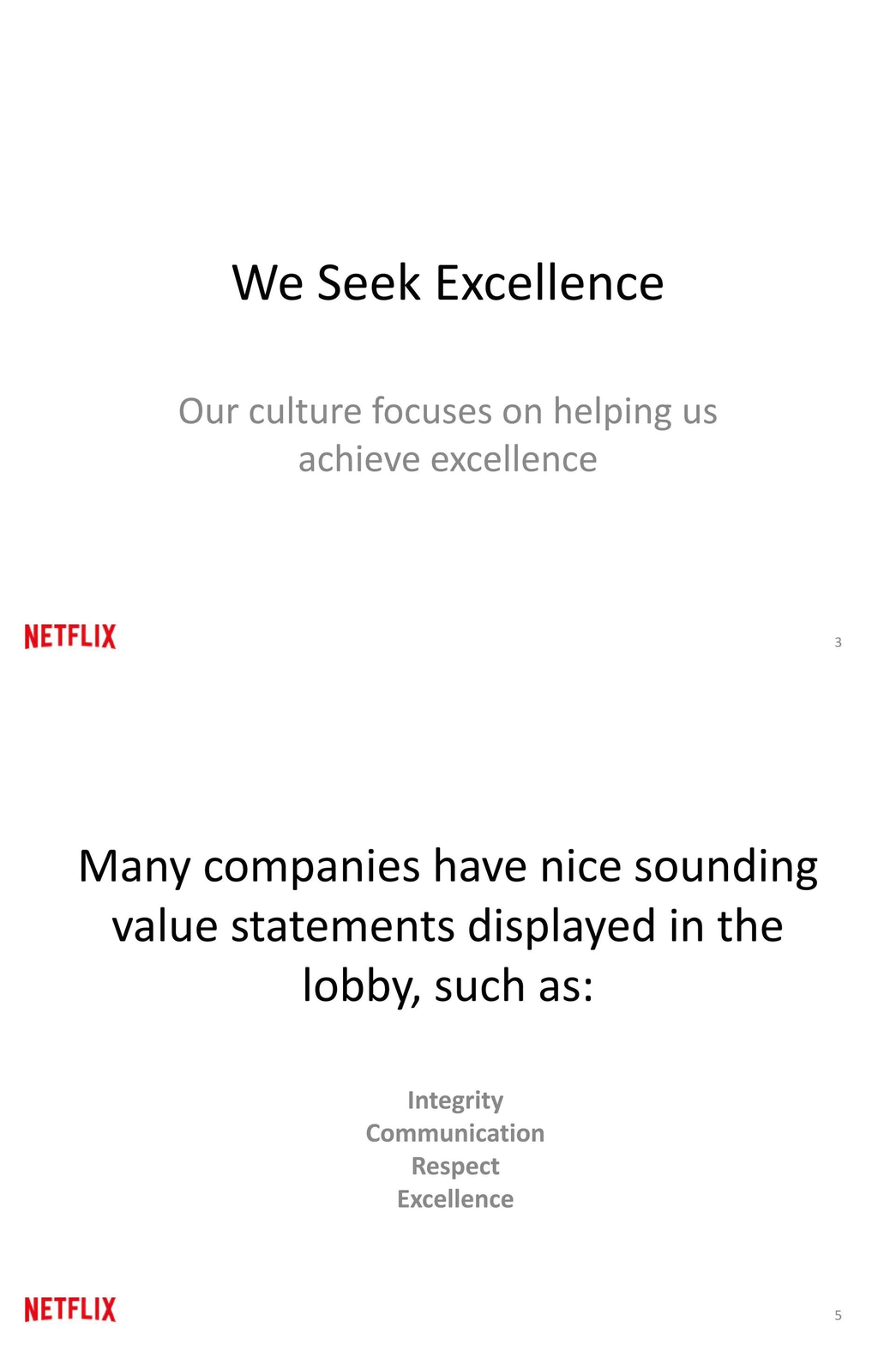
The original Netflix culture deck gets straight to the point, diving into the company's values without much introduction.

Original Netflix culture deck executive summary slides

To give everyone a smoother start, we've added an executive summary right at the beginning, pulling insights from the most current version of the culture deck on Netflix's website.

This summary offers a quick glimpse into what makes the Netflix organizational culture stand out and why it's so effective.

To make sure the most important points catch your eye, we've used a mix of grayed-out text and selective font colors.

This design choice helps highlight the key elements that define Netflix's culture and what makes the company tick, ensuring you know exactly what to focus on.

Interactive Netflix culture deck executive summary slides

This executive summary is spread out over 3 easy-to-follow slides, each with a clear and simple layout.

It's a way to ease viewers into the deeper dive into values that comes next, providing a solid foundation of understanding about Netflix's unique cultural identity from the start.

3) Valued behaviors slide

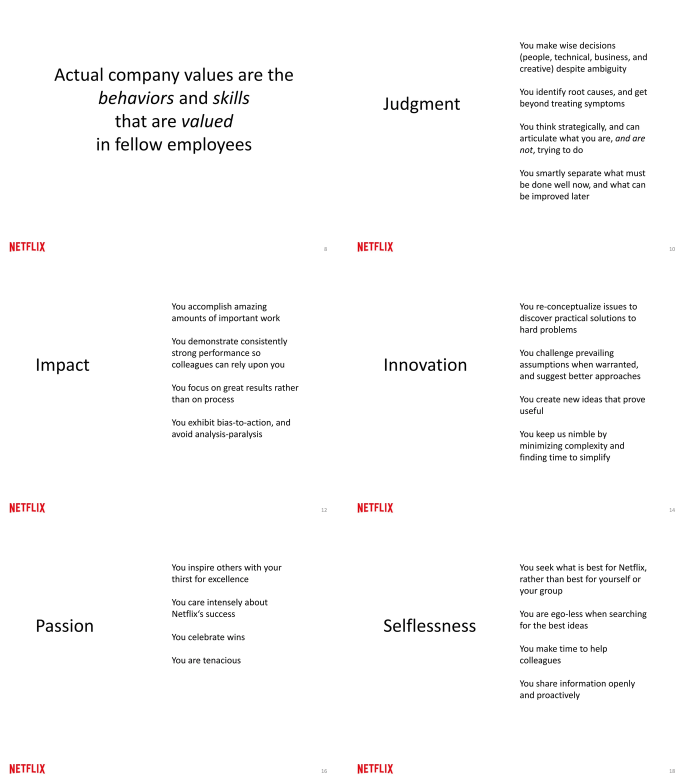
The original Netflix deck, with its hefty 125 slides, is quite the read, especially once you hit the values section.

There, you're met with slide after slide, each packed with detailed explanations about what each value really means in action. It's comprehensive, sure, but also a bit much to take in all at once.

Original Netflix culture deck values slide

So, we've decided to give it a bit of a makeover for clarity and ease of use. We've boiled down this extensive section into just one sleek slide.

Picture this: each value now gets its own neat box, complete with an interactive GIF that captures the essence of the value in a way words alone might not.

And to keep things tidy, we've tucked away the longer explanations into expandable text sections. This way, if you're curious and want to dig deeper into any value, you can do so without the slide feeling cluttered.

Interactive Netflix culture deck values slide

This new setup isn't just about saving space—it's about making the core values of Netflix more approachable and engaging, allowing you to explore them in a more interactive and less overwhelming way.

4) How we work slide

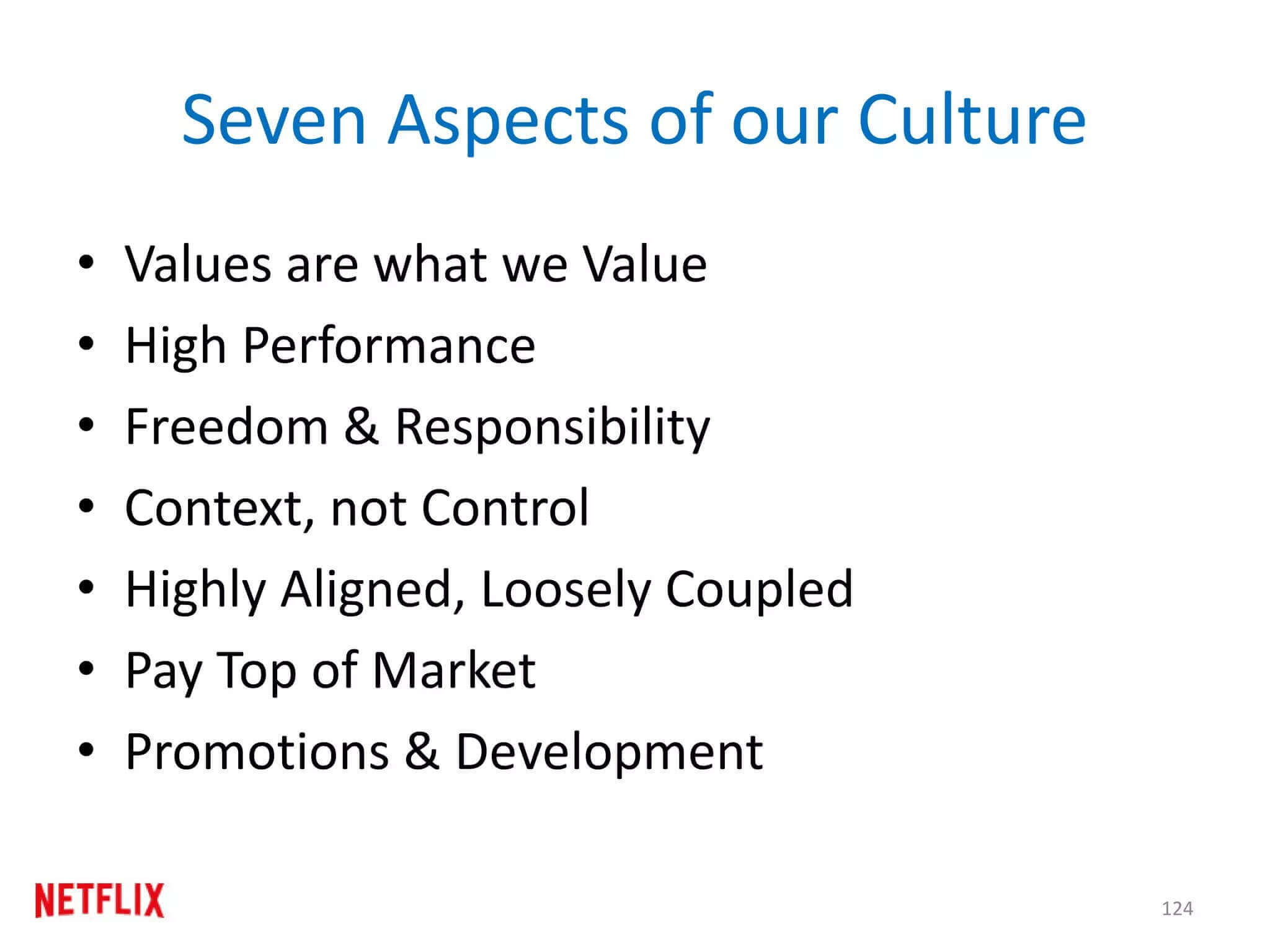
The "How we work" section of the original Netflix culture deck, much like the rest, sprawls across several slides, each dense with text.

These slides, filled with open-ended questions and bullet points, can feel like a snooze-fest without someone there to walk you through them.

They're reminiscent of those text-heavy college presentations that were hard to sit through, let alone get excited about. And the simple graphs used to illustrate points? They scream for a modern makeover with interactive data visualization.

Original Netflix culture deck how we work slide

What we've done is transform this section into a more digestible format by introducing tabs. Now, each key aspect of how Netflix works has its own tab, complete with the option to embed images or play videos right within the deck.

We've also added external links for those who want to dive deeper into each topic, making the information accessible without overwhelming the viewer.

This tabbed approach not only tidies up the presentation but also makes it significantly more engaging.

Interactive Netflix culture deck how we work slide

Our research shows that decks with interactive elements, like tabs, live calculators, and sliders, are not only scrolled to the bottom 41% more often but also keep readers engaged 21% longer on average.

By segmenting the content this way, we've made it easier for everyone to explore what interests them most, turning a potentially dull slide deck into an interactive journey through Netflix's work culture.

5) Summary slide

In the original Netflix culture deck, the approach to summarizing was a bit repetitive.

They rounded off the presentation with the same slide they'd used throughout, highlighting main bullet points before each section, with the upcoming section's name highlighted in a different color.

It's a straightforward method, but it misses the chance to leave a memorable final impression.

Interactive Netflix culture deck summary slide

To give the presentation a stronger finish, we've crafted a fresh summary slide. This new slide doesn't just repeat what's been said; it ties all the key points together in a neat bow.

We've also chosen a powerful quote directly from the original deck, adding a touch of inspiration and reflection.

Interactive Netflix culture deck summary slide

For an even more engaging finish, consider the option of a narrator slide. This allows viewers to walk through the key points at their own pace.

It's a simple yet effective way to ensure the presentation ends on a memorable note, leaving the audience with a clear understanding of Netflix's culture and values.

6) Next steps slide

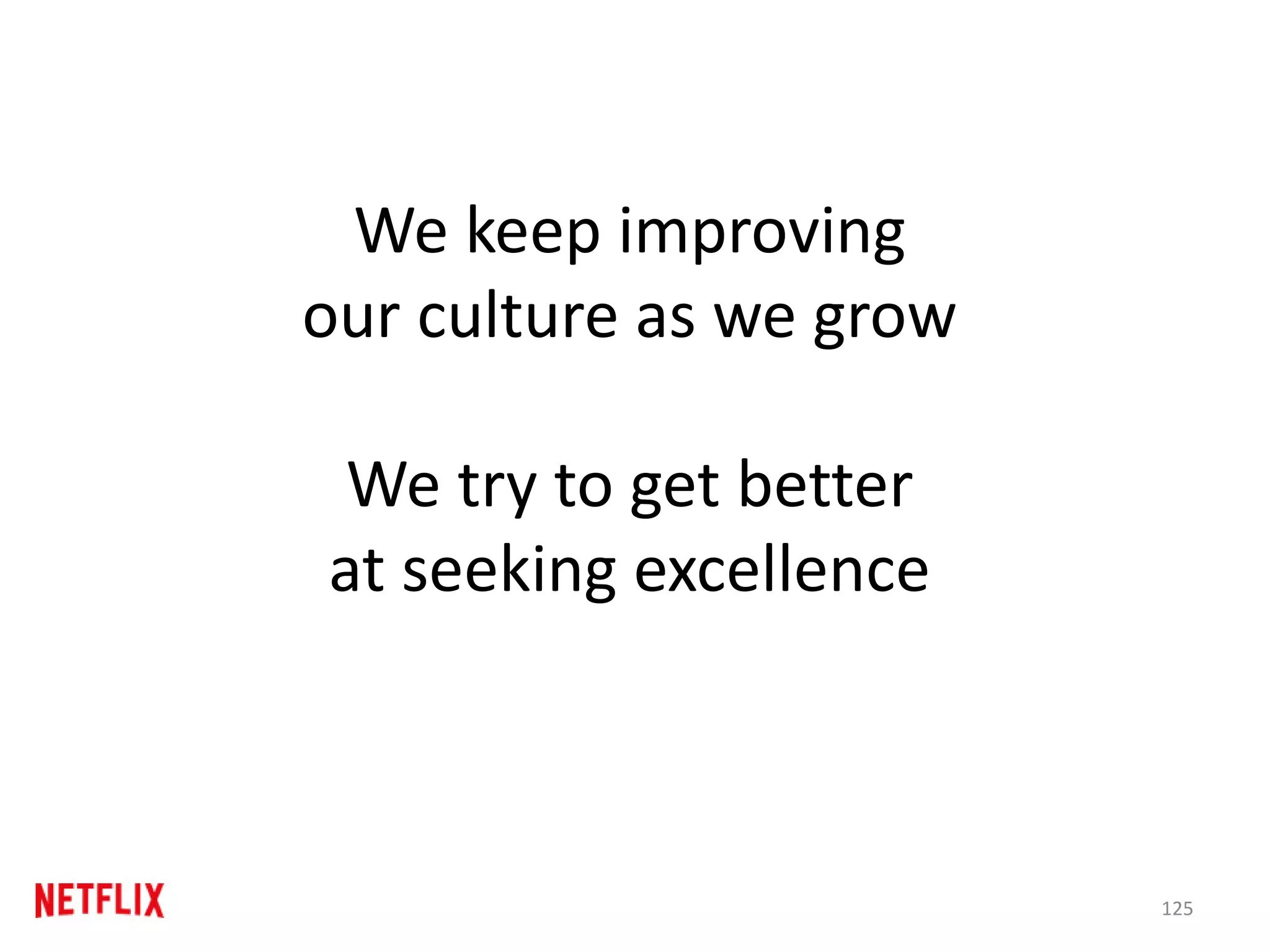
The original Netflix culture deck concluded with a rather broad statement: "We keep improving our culture as we grow. We try to get better at seeking excellence."

While it underscores a commitment to growth and excellence, it doesn't quite guide the reader on what to do next or how to engage further, leaving them in a bit of a limbo.

Original Netflix culture deck last slide

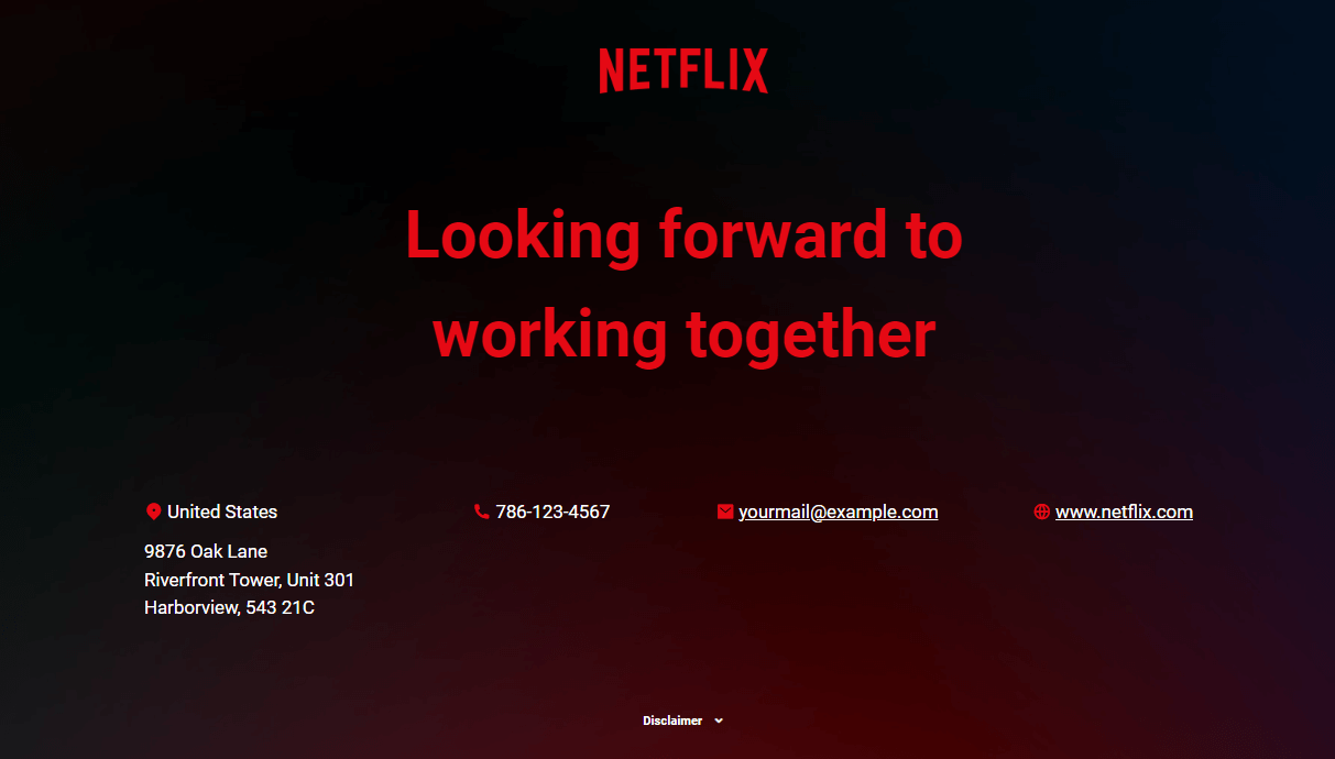
To make the ending more impactful and actionable, we've revamped the closing slide into a clear call to action. We've added contact details and a direct statement aimed at the reader, inviting them to take the next step.

For those ready to dive deeper or even join the Netflix journey, you can include a clickable link that leads directly to the company's current job openings or a form for potential hires to express their interest.

Interactive Netflix culture deck next steps slide

Our findings show that decks with a specific, clear next step—like booking a demo, signing up, or leaving an email—saw a conversion rate that was 27% higher than those ending with a generic "thank you."

This approach not only leaves a lasting impression but also opens the door for readers to become part of the story Netflix is creating.

On top of the enhancements we've made, we've also implemented responsive design to ensure the presentation looks fantastic on any device.

No more pinching and zooming to read the content like in the original Netflix deck. Now, whether you're viewing on a phone, tablet, or computer, the layout adjusts seamlessly for an optimal viewing experience.

But we didn't stop there. We've added access to an analytics panel, giving you the power to track viewer engagement in real-time.

You can see exactly how long people spend on each slide, identify where they might lose interest and drop off, or discover if they're clicking on your call to action.

This valuable insight allows you to fine-tune your presentation, making sure it hits the mark every time.

Storydoc analytics panel

Transform your culture deck from basic to brilliant

Ready to take your culture deck from okay to amazing, just like Netflix's? You're in just the right spot!

Check out our selection of culture deck templates, each tailored for different storytelling needs, to find the one that perfectly captures your company's essence.

Our easy-to-use editor makes sprucing up your culture deck a breeze. You'll have it looking top-notch in no time.

And if you're after some expert advice, simply upload your deck. Our storytelling experts are here to offer personalized tips to help you tweak and perfect your deck.

No templates found
Dominika Krukowska

Hi, I'm Dominika, Content Specialist at Storydoc. As a creative professional with experience in fashion, I'm here to show you how to amplify your brand message through the power of storytelling and eye-catching visuals.

Engaging decks. Made easy

Create your best culture deck to date.

Stop losing opportunities to ineffective presentations.
Your new amazing deck is one click away!