Landing Page vs. Sales Page: Which One Do You Need?

Learn the difference between a landing page and a sales page, when to use which, and what to include in each.


Aurelian Amacker

8 minute read

Landing page vs. sales landing page

Short answer

Landing page vs. sales landing page

The key difference between a landing page and a sales page is that a sales page has one specific goal — providing a potential purchase opportunity.

On the other hand, a landing page could be for various things — to make an announcement, generate leads by capturing email addresses, provide lead magnets, and more.

In order to successfully increase conversions and boost your online business sales, you need to know your landing page from your sales page and exactly where and when to use which.

Therefore, today we’ll cover:

  • The definition of each page
  • The similarities as well as the differences between these pages
  • Where and when to use them
  • Do’s and don’ts you’ll need to consider when creating these pages

And then, we’ll tell you how our platform is capable of building landing pages for your marketing needs.

Let’s get started!

What is a landing page?

Landing pages are post-click web pages that people land on after coming from ads, social media posts, or other traffic sources.

Generally, landing pages:

  • Target a specific audience
  • Provide a specific offer
  • Capture information using lead capture forms


How do you ensure that your landing page is achieving its goals?

You can ensure efficiency and optimal conversion by including the following elements on your landing pages:

  1. Compelling main and supporting headline
  2. Engaging copy
  3. Striking visuals
  4. Clear features and benefits
  5. Short lead form
  6. Strong social proof
  7. FAQ section
  8. Call-to-action (CTA) buttons

Another way to ensure your landing pages are optimized for conversions is to constantly A/B test your landing pages to see what’s working (and what’s not).

Types of landing pages


There are 7 main types of landing pages — each performing a specific function in your sales funnel. You can create a:


1. Splash page

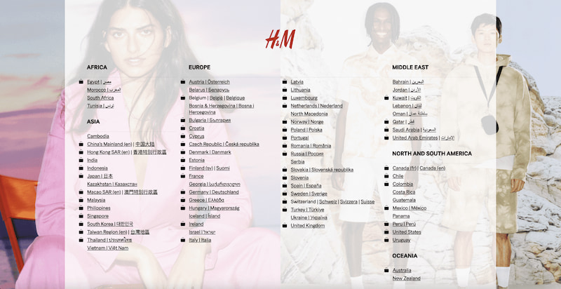
Contrary to other landing pages, splash pages aren’t typically meant for generating leads. They’re only used when you have one specific goal to fulfill, such as:

  • Asking the user their language preference
  • Verifying the user’s age
  • Making an announcement

Here’s how H&M uses a splash page to present language preferences to their visitors:

H&M landing page

Source: hm.com

2. Squeeze page

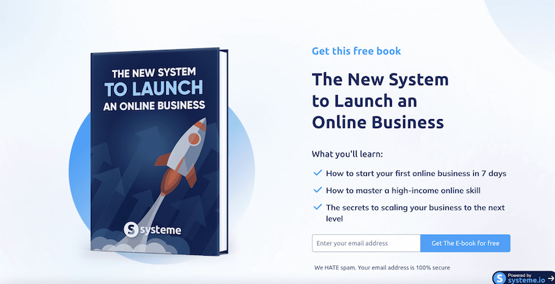
These short-form pages are generally found at the very top of your sales funnel to collect users’ email addresses in exchange for a free offer.

Here’s how systeme.io uses a squeeze page to collect visitors’ verified email addresses:

systeme.io landing page

Source: systeme.io

3. Lead capture or lead generation landing page

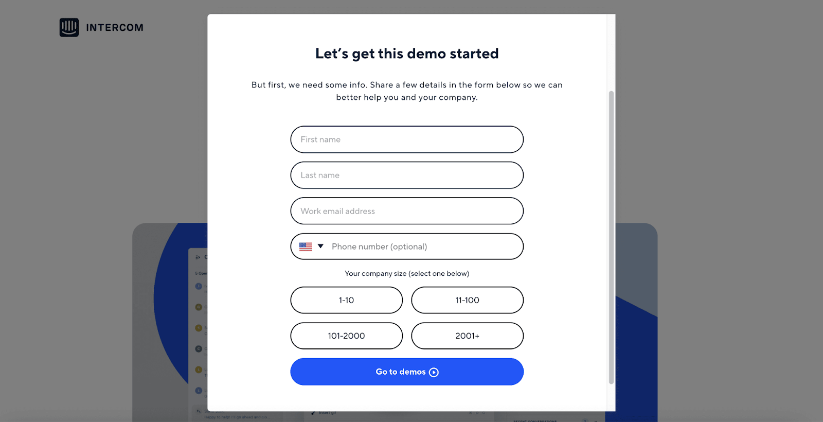
These pages are generally accompanied by a lead capture typically in the form of a popup or a simple signup form.

The main goal of lead capture forms is to collect user data that you can use to your advantage at a later time, perrhaps in lead generation.

Here’s how Intercom used a popup lead capture form to collect leads:

Intercom lead capture

Source: intercom.com

4. Thank you landing page

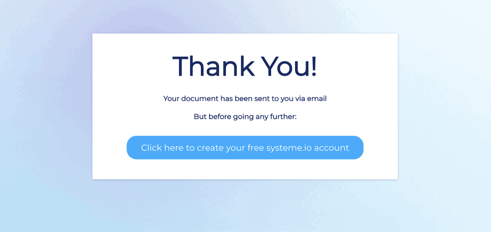
These landing pages are where leads or customers are redirected after they’ve subscribed or made a purchase.

Think of your thank-you page as your lead-nurturing best friend — it has the power to either move a lead further down your sales funnel or set you up for a repeat customer.

Here’s how systeme.io thanks their leads after they’ve provided their email addresses in exchange for an ebook:

systeme.io thank you landing page

Source: systeme.io

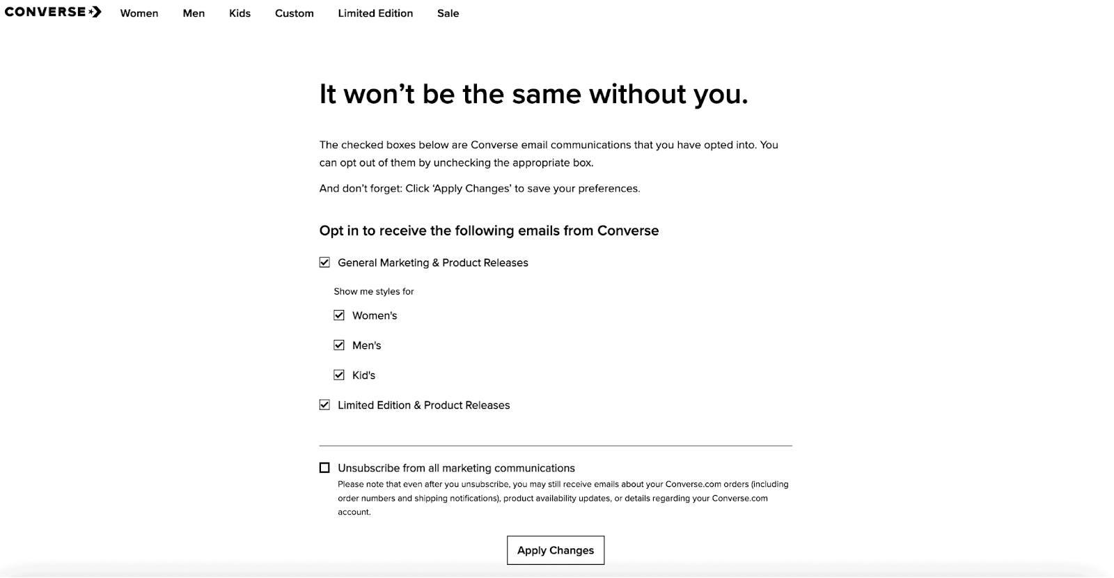
5. Unsubscribe pages

An unsubscribe page is basically a web page that opens when a visitor clicks on the unsubscribe hyperlink at the bottom of an email.

The goal of this page is to confirm that the user actually wants to opt-out of your mailing list.

Here’s an example of how Converse approaches users who want to unsubscribe from their marketing communications:

Converse unsubscribe landing page

Source: Converse.com

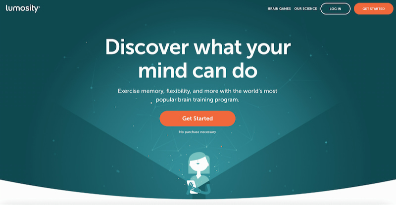
6. Click-through landing pages

These landing pages don’t have a form to collect emails, rather, they act as top-of-the-funnel pages that push traffic into other steps in the sales funnel.

Here’s an example of Lumosity’s click-through landing page:

Lumosity click-through landing page

Source: lumosity.com

And finally — sales pages.


What is a sales page?

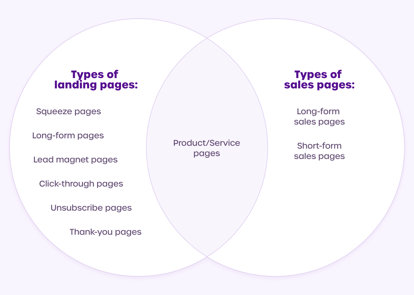
Yes! A sales page can be a type of landing page.

Circling back to the definition:

A sales page is a web page on your website that serves a distinct purpose — getting people to buy a product or service.

When creating a sales page, you’ll typically include elements such as:

  1. A powerful headline and subheadline
  2. Customers’ problems that need to be solved
  3. The solution — your offer’s features and benefits
  4. Proof that your offer actually works
  5. Assurance, such as a 30-day money-back guarantee
  6. Scarcity — include a time-limiting factor such as “this offer is only available for the next 5 days and then it’s gone forever”
  7. The price of your offer

Types of sales pages


Sales pages are split into 2 main categories, depending on the type of offer they're used to present, the copy they contain, and the main purpose they serve.

Types of sales pages

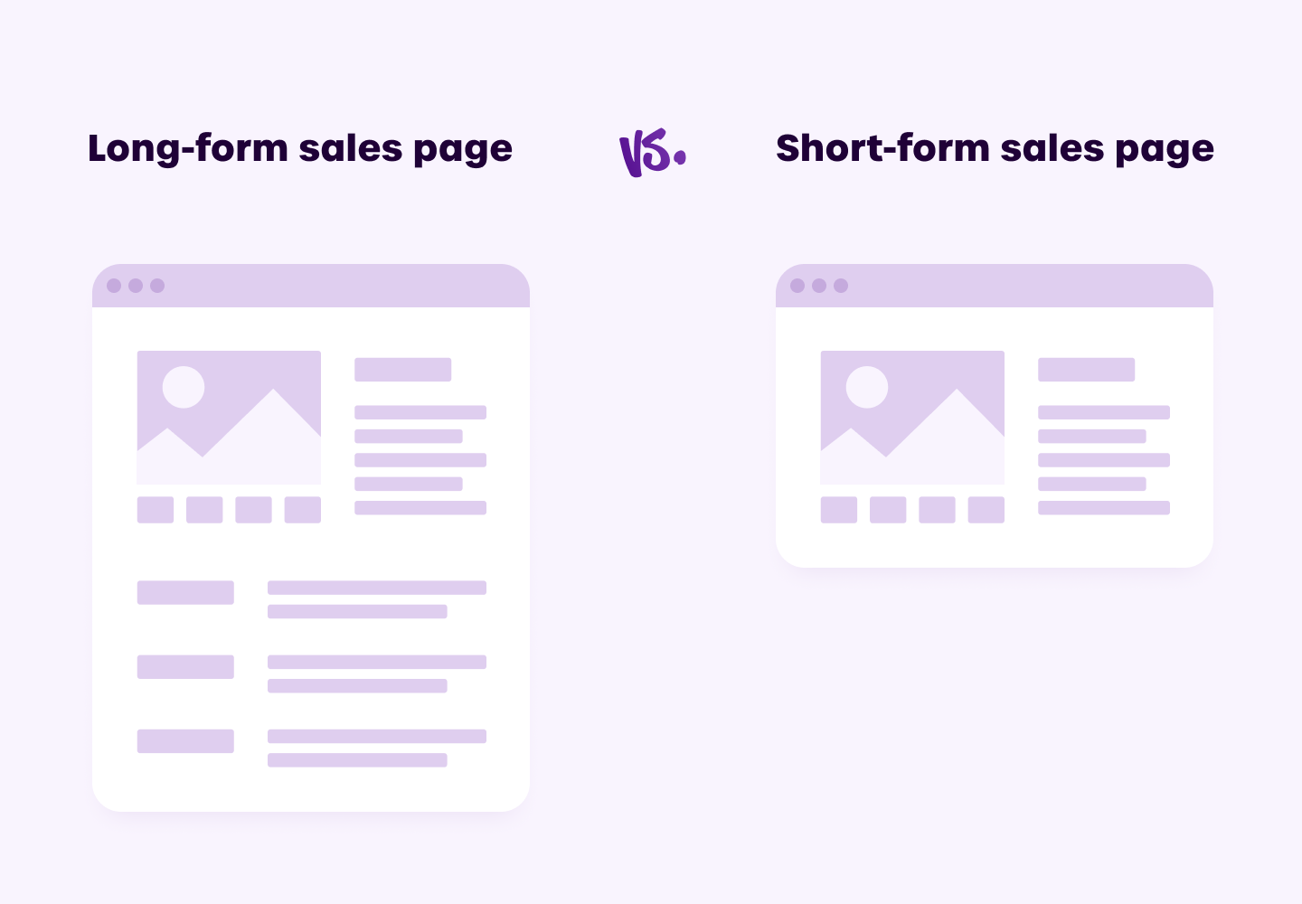
1. Long-form sales pages

If your offer is:

  • Complex or technical
  • Highly priced (between $100 - $10,000)
  • Marketed to a cold audience that doesn’t know or understand it yet
  • Requires a time commitment from buyers

Then a long-form sales page would drive you more conversions and sales.

Simply because it features persuasive copy that details everything about the product, it eliminates doubts and fears for prospects, and offers incentives to push readers to make a purchase. You can leverage interactive experiences on the sales pages by using a gamification software for example.


2. Short-form sales pages

A short-form sales page is your typical product page on Amazon, ecommerce stores, or even info-product pages.

Generally, these pages include:

  • Low-cost offers (under $100)
  • Brief copy explaining the product (features and benefits)
  • Sections for reviews, pricing, and FAQs

A short sales page tends to work well with digital products that make the buying process frictionless for prospects.

Additionally, these sales pages normally feature offers that are simple and easy to understand.

Both short-form and long-form sales pages work in their respective areas to drive excellent conversion rates, but it all depends on the context.


3. Sales one-pagers

here’s actually a middle ground between long-form and short-form sales pages. It comes in the form of business one-pagers. These serves mostly B2B business as part of thier prospecting outreach.

These Sales pages are normally part of your Product Marketing effort and have 2 main types: (1) a product one-pager - used for showcasing SaaS or industrial products (see templates)., and (2) a sales one-pager which is used for presenting prospects with your solution or service (see templates).

What’s the difference — landing page vs. sales landing page

Now, a lot of posts use the terms “landing pages” and “sales landing pages” interchangeably, but that’s not always the case — allow us to explain.

Landing page vs. sales landing page

Landing pages and sales pages are similar in that both ensure:

  • A constant stream of leads, conversions, and revenue
  • They reach a bigger target market
  • A smooth customer experience

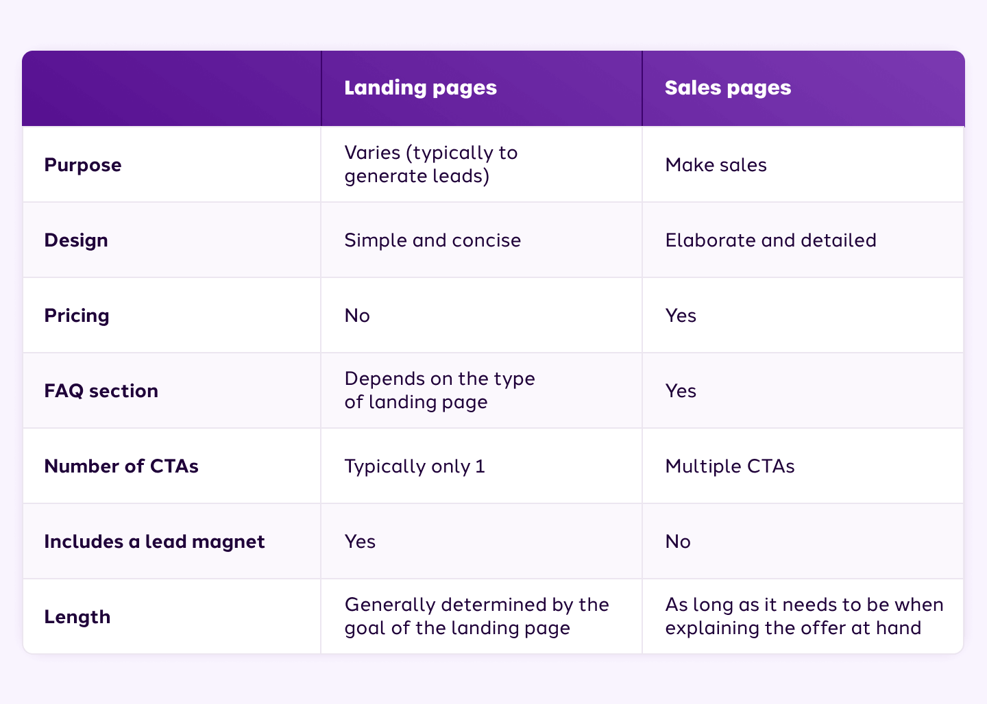
Here’s how sales pages and landing pages differ:

Sales page vs. sales landing page

So, how do you know which page to use, where and when?


Sales pages vs. landing pages: Where and when to use them?

Unfortunately, there’s no one definitive answer to this question.

However, here are 2 guidelines to determine whether you should use a landing page or a sales page:

  1. If you’re looking to generate leads to build your mailing list or build a community of members — use a landing page
  2. If you’re looking to sell your offer directly to your target audience — use a sales page

In most cases, you’ll actually end up using both these pages. So, you’ll need to make sure each individual page is optimized for its respective goals.

What exactly do we mean by optimizing?

  • Setting a clear goal for each page
  • Having them in the right places
  • Including all necessary elements (don’t mix the 2 pages’ elements up)
  • Making your buyer’s journey a smooth one

PRO TIP: Don't forget to optimize each page for mobile devices more than 55% of your online traffic comes from there.

Landing page and sales page do’s and don’ts

To give a little boost to get you started on creating your web pages, here are a few do’s and don’ts to keep in mind:


1. Do — Use visuals that are relevant

Instead of using images simply because they look nice, try to only add images that support your page’s goal.

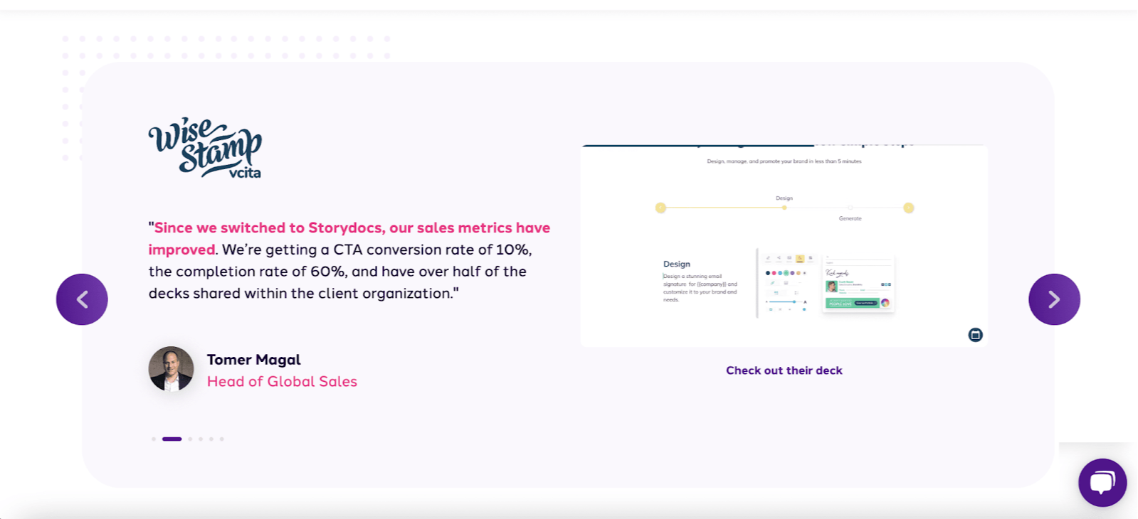
For example, add a headshot next to testimonials from happy customers. Why? Because this can actually boost trust and credibility in your business.

Using an AI headshot generator can save time and ensure you get high-quality images that perfectly match your needs.

Here’s how our team used headshot images together with some customer case studies to boost our trust and credibility:

Storydoc landing page

2. Don’t — Clutter your page with fluff

Stick to the point!

The purpose of your page is to attract potential customers and convert them into actual customers. Try not to confuse them with high volumes of copy or an unnecessary amount of visuals.

For example, limit the number of design elements — such as fancy widgets, fonts, buttons, and colors. While you can use plugins for landing pages, simplifying your design allows you to leverage the power of contrast to draw attention to the elements that are the most important, like the CTA or the call widget.


3. Do — Make your CTA button stand out

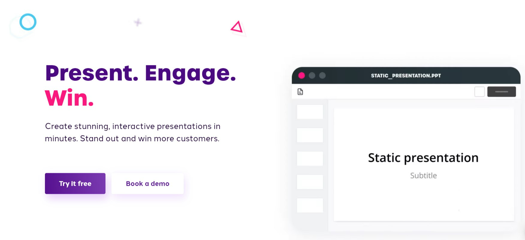
Ways to make your button stand out are to use contrasting colors, make the font large and bolded, and make the actual button big.

Take a look at how we make sure our “Try it free” CTA button grabs the attention of our page visitors:

Storydoc landing page

4. Don’t — Include navigational links

Ideally, you want to control the direction your readers take when browsing your pages.

Including navigational links on your pages gives your visitors an excuse to direct their attention away from your page. So, avoid them at all costs!


5. Do — Test your pages

A/B testing is a crucial part of creating sales pages and landing pages!

If you want to create successful pages, you need to conduct A/B testing to ensure that the elements on your page work together to convert more customers.

You also have to test things like page load speed, as a slow landing page will make people leave long before they convert. Optimized images, HTTP caching, and limiting redirects can all increase speed, but if these fixes don’t do much, your host may be the problem. Fortunately, you can switch hosts easily using the All-In-One WP Migration plugin if you have a WordPress site. This will make switching a lot easier.


6. Don’t — Ask for too much information

Stick to only asking for the necessary information.

For example, if you’re offering a free module from an online course, you don’t need to ask for their social security number or credit card information — all you’ll need is their email address and maybe a name to send a personalized email containing the course module.

Using Storydoc’s one-pager builder to make sales pages that truly stand out

With Storydoc you can easily use pre-designed slides to create an impressive interactive sales page quicker than any AI website builder.

It can be used to:

  • Create high-converting sales landing pages that generate leads
  • Build sales one-pagers
  • Build reports on your products
  • Build case studies
  • Make sales decks to introduce your offer to potential investors
  • Create sales proposals that make an immediate impact

The best part? We have an extensive library full of business-ready sales page templates that are ready for you to use!

Every sales page has been designed to provide the best possible mobile-watching experience, thus increasing audience engagement.

Getting started is as easy as:

  • Choosing your template — pick between sales one-pagers, sales pitch decks, case studies, and proposal templates as well as presentation, brochure, or ebook templates
  • Editing and customizing the content — add, remove, or rearrange elements using pre-set components, suited for the most commonly-used parts of business presentations (think timelines, market analysis, processes, ROI calculators, solutions overviews, and more)
  • Creating personalized page versions — tailor your Storydoc pages to a particular client by adding their logo, name, or a unique introduction

And it gets better — Everything happens in a component-based editor, no code involved, ever!

Takeaways

  1. A landing page and a sales page have a few key differences. Keep your goals in mind while deciding which page to use and when.
  2. The term “landing page” includes a bunch of other types of web pages. Such as splash pages, squeeze pages, and more.
  3. Choose the right page and give your audience the information they need. Both a landing page and a sales page tend to go hand-in-hand in a sales funnel to bring you optimal conversation rates.
  4. Optimize and test your pages to increase efficiency. Include all necessary elements in your pages and focus on the main benefits and how your solution can get them to the promised land.

Now you know all there is to know about when to use a landing page and a sales page, why don’t you put these tips into practice? Just choose a template from our extensive sales page template library and work your magic!

Good luck and enjoy!

Aurelian Amacker

Founder of systeme.io and online entrepreneur since 2010.

Create your best presentation to date

Try Storydoc interactive presentation maker for 14 days free

(keep whatever you make forever!)