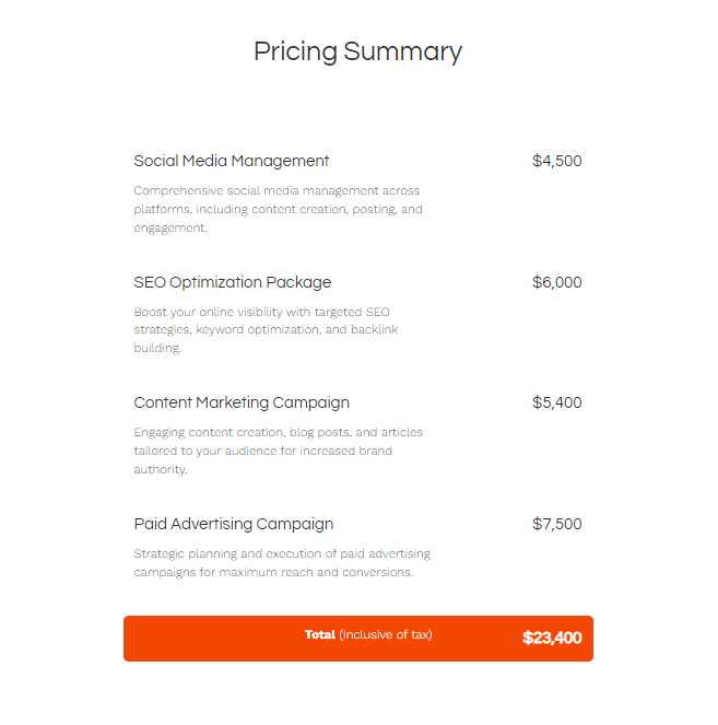
4) Maintain visual consistency
Maintain a consistent visual theme throughout your proposal. This includes using a uniform color palette, typography, and imagery style.
Consistency in design elements fosters a sense of professionalism and makes your proposal more readable and aesthetically pleasing.
5) Use white space strategically
Don’t underestimate the power of white space. Cluttered designs can be overwhelming and detract from your message.
White space helps in making the proposal look clean, organized, and more inviting to read. It allows your content and key visuals to stand out, making them more impactful.
6) Embrace interactivity
For digital proposals, consider adding interactive elements like clickable contents, embedded videos, or animations. These elements can make your proposal more engaging and memorable.
For instance, an embedded video could showcase a successful campaign or a testimonial from a satisfied client. Interactive elements hold the reader's attention and provide a dynamic way to present complex information.
7) Make your deck easy to navigate
Ensure your proposal is easy to navigate. This includes a clear and intuitive layout and clearly defined sections. Easy navigation enhances the user experience, making it more likely that the client will engage with the entire document.
8) Emphasize key points
Use design to highlight key information. This could be through bold text, animation, or using grayed-out content to draw attention to important data or testimonials.
Highlighting key points ensures that they are not missed and reinforces the most crucial aspects of your proposal.
Here's a great example of using grayed-out content:


