How to Easily Make a Multimedia Presentation (Tools & Templates)

Learn how to create a multimedia presentation in 6 steps with videos, GIFs, animations, audio, & photos. Go beyond PowerPoint - capture attention & engage.

How to make a multimedia presentation

helped business
professionals at:

WorkDay IHeart Meta Nice American Cancer Society Xerox

Short answer

What is a multimedia presentation?

A multimedia presentation is a deck that uses a blend of text, images, audio, video, and interactive content to captivate an audience. It's a dynamic, engaging way to share your story where each media element plays its part to create a memorable experience.

Why PowerPoint is the wrong tool for multimedia presentations

Most of us are still using PowerPoint to create our presentations. And knowing intimately how to create a multimedia presentation in PowerPoint, I can tell you it’s not easy, and it ain’t fun.

This is a problem because the work you’ll have to put in to create a half-decent multimedia presentation with PowerPoint is not worth the outcome.

Sorry, but the tool was just not built for this. And trying to force it to do something it wasn’t meant to do will take away from your ability to tell an engaging story.

Wanna know why?


1) PowerPoint was built for how stories were told 30 years ago

PowerPoint's technology hasn't evolved much since its inception. If you're using it for your business presentations, you're relying on a static decades-old content format while your audience is used to getting their content in a very different way.

Most of us now expect dynamic and interactive content, videos, audio, and clickable elements we control. That’s not PowerPoint.


2) It’s hard to design (well) with PowerPoint

Creating an attractive PowerPoint presentation requires a good eye for design and a fair amount of time. Even little tweaks can ruin the layout, as PowerPoint has no safeguards that prevent you from commiting design crimes.


3) Personalizing with PowerPoint takes ages

If you want to personalize presentations for different audiences, you need to create separate files for that and tweak them manually. This will take you absolute ages and leaves plenty of room for error.


4) It has a horrible mobile experience

We know for a fact that 1 in 3 presentations being viewed on mobile devices. But PowerPoint was not built for mobile, and you wouldn't wish a PPT mobile experience on your worst enemy.

This means that if your audience doesn't live in a mobile-free zone, PowerPoint is a massive drawback.


5) PowerPoint has no analytics

PowerPoint doesn't provide an analytics dashboard, which means you don't have access to valuable feedback. You can’t measure if your presentation is nailing it or getting the same attention as the dishes in your sink.

This is a problem. Because if you don’t know how you perform, you can’t improve.

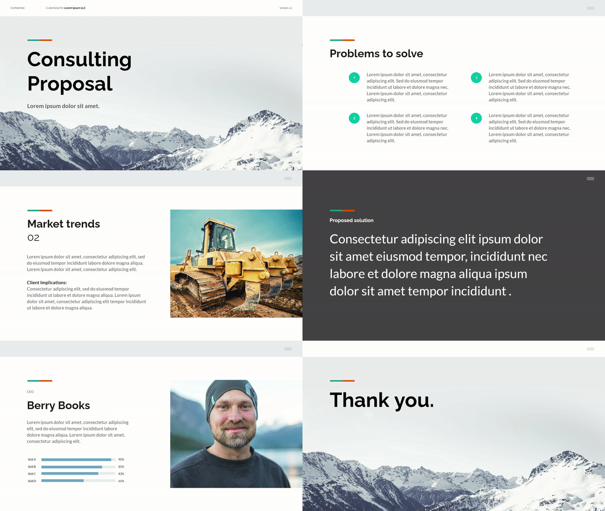
Here’s what a PowerPoint looks like compared to a modern interactive multimedia presentation:

Static PPT example
Static PPT
Interactive Storydoc example
Interactive Storydoc

How to create engaging multimedia presentations in 6 easy steps

Now let’s see how a modern multimedia presentation is done. For some of us, creating a presentation that resonates can feel overwhelming. But with the right presentation maker and a clear plan, it's as easy as following a recipe.

6 steps to create a multimedia presentation:


1. Tell our AI what presentation you want to create

Are you pitching a product, explaining a concept, or presenting quarterly results? Tell our AI the purpose of your presentation. This helps it generate content that's on point and relevant.


2. Introduce yourself, your company, and your product or service

You can also start by giving our AI a brief rundown of who you are, what your company does, the product you're showcasing, and the industry you're in. This helps the AI understand your context and tailor the presentation to your needs.

Introduce yourself to Storydoc's AI assistant

3. Pick a design template

No need to start from scratch. Storydoc offers a variety of presentation templates optimized for performance based on real-world data. Choose one that aligns with your brand and message.

Pick a Storydoc design template

4. Customize your presentation

Now, it's time to make the presentation truly yours. Add your text, tweak the design, and watch as the template adjusts to accommodate your content.

Sprinkle in some interactivity with clickable tabs, real-time variables for charts, or any other interactive elements that fit your content.

Then, upload your own multimedia or let our AI generate some for you.

You can also utilize graphic asset libraries like Adobe Stock, Shutterstock, or Icons8, offering everything from check mark icons for bullet points to neon graphics for futuristic presentations.

Customizable Storydoc multimedia presentation

5. Add dynamic personalization

Our no-code editor allows you to easily add dynamic variables to your multimedia presentation. This means that you can personalize your decks at scale in just a few clicks.

The main benefit? Every deck looks like it was tailor-made for each specific reader, which can make your audience feel special and, in turn, significantly boost engagement.

Personalized Storydoc multimedia presentation

6. Review and refine your presentation

Take a moment to review your presentation. Make sure everything looks good, the flow makes sense, and your message is clear.

But making a mistake is not as critical as it is with PowerPoint since Storydoc lives online and not on your audience’s computer.

So If you need to fix any mistakes after the presentation has been sent over, you still can. You control the version everybody sees, forever.

Storydoc multimedia presentation

7. Advanced: Improve your presentation based on insights from analytics

Every presentation you create using Storydoc comes with access to an extensive analytics suite that gives you real-time insights into how your deck is performing.

Finally, you can see when your presentation is opened, how much time is spent on each slide, and even when your audience drops off. This enables you to quickly identify and fix any bad content.

One of the most powerful features of Storydoc's analytics panel is the ability to compare different versions of your presentation.

You can use this to A/B test your presentations, remove the guesswork, and continually improve based on data.

Even better, Storydoc's analytics panel integrates with your CRM and email marketing software. This means you can see all your data in your CRM where you and your team are already working, and use it to inform your sales and marketing strategies.

If you want to learn more about how it works, watch this short video:

Storydoc analytics pa

How to use multimedia to bring your presentation to life (3 techniques)

Multimedia is more than just a way to make your presentation look more cool—it can transform your content into an immersive, interactive experience that people enjoy and share with friends and colleagues.

Let me show you how you can strategically leverage multimedia to captivate your audience, simplify complex ideas, and create a lasting impact.

3 key multimedia techniques that maximize engagement:


1. Narrate your design through scrollytelling

Scrollytelling is a unique blend of scrolling and storytelling. It's an interactive way of presenting content that takes your audience on a narrative journey as they scroll through the presentation.

This approach combines text, images, videos, and animations into “scenes” in a play that readers can move through at their own pace.

Scrollytelling simplifies complex content into easy to understand pieces which reduces cognitive load, increases comprehension, and makes your content highly memorable.

Here’s an example of Storydoc scrollytelling:

Narrator slide example

2. Bring yourself into the presentation with video bubble narration

Video bubble narration is a unique way to personalize your multimedia presentation. It involves adding a small video of yourself to your deck, providing commentary or extra insights.

The video bubble gives your audience a sense of connection with you, making the presentation more personal and engaging.

It's like having a one-on-one conversation with each member of your audience, which can significantly enhance their interest and investment in your deck.


3. Tell stories with animations and videos

Animations and videos can bring your message to life, illustrate complex processes, and provide visual examples that reinforce your points.

For instance, an animation could be used to demonstrate a process step-by-step, making it easier for your audience to understand.

A video could provide a real-world example that supports your argument, making your content more relatable and impactful. Perhaps use AI video maker tools to make the content more attractive.

Here’s a great example by one of our clients:

Octopai - Outbound sales one-pager

Octopai - Outbound sales one-pager

An outbound one-pager identifying a problem in modern-day analytics and offering an easy-to-grasp solution.

How to make highly engaging presentations with multimedia

Using multimedia is not just about adding visual flash—it's about guiding your audience's attention, enhancing understanding, and encouraging interaction.

Let's explore how simple animations and interactive content elevate your presentations from boring to share-worthy.


1. Direct attention using simple animations

Animations are a great way to guide your audience's attention. But complex or dominant animations can be distracting and may take attention away from your text message.

How to direct attention using animation:

  • Arrows: Arrows can be used to point out key information or guide your audience through a process. They're a simple yet effective way to direct attention where you want it.
  • Entrance animation: Entrance animations can be used to introduce new content or highlight a key point. They can create a sense of anticipation and make your presentation more dynamic.
  • Grayed-out content: Graying out content that's not currently relevant can help your audience focus on the key points. It's a subtle yet effective way to guide your audience's attention.

Here’s an example of what it looks like:

Example of grayed-out content

2. Get readers involved using interactive content

Interactive content makes your presentation more engaging and gives your audience a sense of control. It also makes your content more memorable, as people tend to remember things they actively engage with.

Interactive content you can incorporate into your presentations:

  • Tabs: Tabs allow you to neatly organize your content into sections, making it easy for your audience to navigate through your presentation. For instance, you could use tabs to separate different topics or information intended for different target groups.
  • Sliders: Sliders are a dynamic way to present a range of data or to show progression. For example, you could use a slider to illustrate the growth of your company over time or to show how a particular metric changes under different scenarios.
  • Calculators: Interactive calculators add a personal touch to your deck. They allow your audience to input their own data and see personalized results. For instance, you could use a calculator to show potential savings from using your product or to calculate ROI.
  • Live graphs: Live graphs take data visualization to the next level. Instead of static charts, live graphs allow your audience to interact with the data. They can zoom in on specific data points, compare different data sets, or see how the data changes over time.

Here’s an example of a presentation using interactive content:

Interactive presentation example

Multimedia presentation best practices

It's not enough to just add media like animations and videos—you need to use them to improve rather than hurt engagement.

Here are the best practices for making a multimedia presentation that works:

  1. Use media that exemplifies your audience's needs and preferences.
  2. Use media that adds context to your presentation text.
  3. Make sure your animations and videos support your text rather than compete with it. Consider looking into text-to-video AI tools to ease your process.
  4. Ensure that your media is high-quality and take advantage of design tools or background removers to ensure your narrative goals are achieved in your presentation.

Best multimedia presentation examples beyond PowerPoint

Let’s see the best multimedia presentation examples that break the PowerPoint mold.

These examples show you new and effective ways for making engaging content and how to stand out in a sea of same-old PowerPoint presentations.

Let’s go!

Meta - Interactive corporate report

Meta - Interactive corporate report

Insights and trends from Israel's thriving consumer-facing industry. A comprehensive review of the B2C ecosystem's performance and future prospects.

HealthTech SNC - Simplified data-heavy report

HealthTech SNC - Simplified data-heavy report

An extensive data report from a non-profit organization made easy to digest thanks to interactive, engaging design.

How to make a multimedia presentation

Cannasoft - Investment pitch deck

A hard-hitting investment deck of a publicly traded tech company dedicated to medical cannabis manufacturers.

Octopai - Outbound sales one-pager

Octopai - Outbound sales one-pager

An outbound one-pager identifying a problem in modern-day analytics and offering an easy-to-grasp solution.

Orbiit - Visually narrated sales deck

Orbiit - Visually narrated sales deck

Visually narrated sales deck of a virtual networking platform telling AND showing readers what's in it for them.

Matics - Digital product brochure

Matics - Digital product brochure

A product brochure showing smart manufacturing execution systems on a mission to digitalize production floors.

Galor - Personalized product sales deck

Galor - Personalized product sales deck

A highly-converting product sales deck with a modern design, interactive narrated content, and an integrated chatbot.

RFKeeper - Retail proposal deck

RFKeeper - Retail proposal deck

A dynamic, highly visual proposal deck for a retail software provider, designed to grab and keep attention.

Drive - Automotive research white-paper

Drive - Automotive research white-paper

A white-paper showing high-level research on electric vehicle charging wrapped in a stunning interactive experience.

If you want to see more multimedia presentation samples, check out our post containing the perfect presentation examples to set you apart from the competition.


Interactive multimedia presentation templates

Getting started with making your multimedia presentation is often the hardest part. But with interactive multimedia presentation templates, you can hit the ground running.

They take care of the design and interactivity, so you can focus on what matters most: your content.

So why wait? Grab a template.

No templates found
Dominika Krukowska

Hi, I'm Dominika, Content Specialist at Storydoc. As a creative professional with experience in fashion, I'm here to show you how to amplify your brand message through the power of storytelling and eye-catching visuals.

Engaging decks. Made easy

Create your best presentation to date

Stop losing opportunities to ineffective presentations.
Your new amazing deck is one click away!