How to Design a White Paper to Stand Out (+Templates)

Learn how to design a white paper to engage your audience and drive action. See top white paper design examples and get customizable white paper templates.

How to design a white paper

helped business
professionals at:

WorkDay IHeart Meta Nice American Cancer Society Xerox

Short answer

How to design a white paper?

  1. Design for scanners, not readers

  2. Introduce narrative flow

  3. Frontload the ROI

  4. Use white space to control pacing

  5. Use progressive disclosure to reward curiosity

  6. Never ask a paragraph to do a visual’s job

  7. Personalize where possible

  8. Keep your branding consistent

  9. Always optimize for mobile

  10. End with a conversion slide, not a conclusion


Scroll down to read the full guide ⤵

What makes a great white paper design?

A great white paper design makes complex information easy to understand and engaging to read. It uses clear structure, clean layout, visual storytelling, and mobile-friendly formatting to guide the reader.

Good white paper design supports the content, helping readers quickly grasp key points and stay focused from start to finish.

What’s the best white paper file format?

PDF PowerPoint (PPT) Storydoc
- Widely used and easy to send as an attachment - Easy to edit and present visually in slides - Built specifically for digital, scroll-based reading
- Good for printing or offline use - Best for summarized info, not long-form content - Great for longer stories with visuals, text, and interaction combined
- Fixed layout – what you see is what you get - Layout often breaks when exporting or sharing - Fully responsive on desktop and mobile
- Can feel static and dense to read - Often too fragmented for deep storytelling - Feels like a guided journey, not a file dump
- No way to see if anyone reads it - No tracking or engagement data - Includes analytics: see views, read time, and drop-offs
- Hard to personalize for different audiences - Can be customized but time-consuming - Easy to personalize at scale (e.g. by industry or name)
- Not mobile-friendly – small text, zoom required - Often unreadable on mobile devices - Adapts automatically to any screen size
- Easily lost in inboxes or downloads - Needs manual follow-up - Share as a link that opens instantly, no downloads needed

How to design a white paper that keeps readers engaged

Design plays a bigger role in white papers than most people realize. In a world where attention spans are short and most people are reading on their phones, dumping a wall of text on a page just doesn’t cut it anymore.

If you want people to actually make it past the headline, your design needs to guide them - visually and logically - through your content.

In this section, I’ll walk you through how to design a white paper that feels less like a document and more like a guided experience.

1) Design for scanners, not readers

Most people will skim your white paper, not read every word. That’s why it should be built like a landing page - with clear headings, visual blocks, stat callouts, and short sections that deliver value fast.

If someone only reads your headlines and bolded stats, they should still walk away with the main message.


Here's a great white paper design example:

2) Introduce narrative flow with modular design

Instead of a traditional “document,” think of your white paper as a story broken into visual scenes.

Each scroll should reveal a self-contained block that builds on the last - problem, insight, solution, proof. This keeps readers engaged and makes complex ideas easier to digest.

How to apply narrative flow to a white paper

  • Use vertical sections to separate key ideas (e.g. one idea per screen)

  • Start with a hook or insight to frame the problem

  • Let each section answer: “What’s the one thing I need to take away from this?”

  • Use layout and visuals to guide pacing - don’t treat it like a static PDF

Example of a well-designed white paper:

3) Frontload the ROI

The first scroll is make or break.

Don’t save the insight or hook for page four - show readers why they should care right now.

Whether it’s a bold stat, a killer quote, or a question that reframes the problem, your opening design should grab attention instantly.

White paper executive summary example

4) Use white space to control pacing

White space isn’t just for aesthetics - it controls how fast your reader moves. Tighter spacing can create urgency.

Wider gaps can help them pause and absorb.

Use space intentionally to set the rhythm of your story and make the content easier to follow.

White paper design example

5) Use progressive disclosure to reward curiosity

Not every detail needs to be visible from the start.

Use tabs, toggles, and expanders to let curious readers dive deeper - without overwhelming the rest. This keeps the experience clean while offering depth for those who want it.

How to use progressive disclosure in white papers

  • Keep key takeaways visible by default

  • Tuck supporting data or secondary insights behind “read more” elements

  • Use animation or microinteractions to reveal details smoothly

White paper expandable text sections example

6) Never ask a paragraph to do a visual’s job

If you're walking someone through a process, showing a shift over time, or comparing options, don’t leave it all to the imagination. A simple visual can do the job faster - and stick better.

Think of it like this: whenever you're tempted to explain something in a long paragraph, there's probably a cleaner way to show it.

A good visual doesn’t just sit on the page - it helps the message land.

When to switch to a visual instead of text

  • Describing a flow, timeline, or before/after

  • Comparing two or more options

  • Showing how a solution works in steps

  • Sharing a customer journey or success metric

White paper scrollytelling example

7) Personalize where possible - even visually

White papers often feel generic.

Even small touches - like using an industry-specific visual, a relevant case study, or personalized intro - can dramatically increase engagement.

The more it feels “made for me,” the more likely someone is to read it through.

White paper personalization example

8) Keep your branding consistent but subtle

Your white paper should look and feel like it came from your brand - but it shouldn’t shout about it.

Use your colours, fonts, and logo consistently, but let the content take the lead. Good design reinforces brand trust without distracting from the message.

How to apply branding to a white paper

  • Use a limited colour palette (1–2 primary colours + 1 accent)

  • Stick to brand fonts for headings and body text

  • Place your logo in the header or footer - no need to repeat it everywhere

  • Avoid turning every slide into a marketing ad - design with restraint


Storydoc can take care of most of this for you - the editor can automatically extract your branding elements from the website.

Branded white paper example

9) Always optimize for mobile - not as an afterthought

Chances are, most people will open your white paper on their phone. And let’s be honest - PDFs are a nightmare on mobile.

Tiny text, endless scrolling, and constant pinching and zooming just to read a sentence? No one’s sticking around for that.

If your layout doesn’t adapt naturally to smaller screens, you’re losing readers before they even get to the good part. Design mobile-first or, at the very least, test how it feels to read on the go.

White paper mobile design example

10) End with a conversion slide, not a conclusion

Your white paper shouldn’t trail off like a research paper. If someone’s made it to the end, they’re interested - so don’t leave them hanging.

The final screen is your moment to gently guide them toward what comes next.

This doesn’t mean dropping in a hard sales pitch. It means offering a natural next step that matches the intent of the paper.

If you’ve explained a product-led solution, invite them to try it. If you’ve made a strong case for change, offer to walk them through how you can help.

Examples of good calls to action

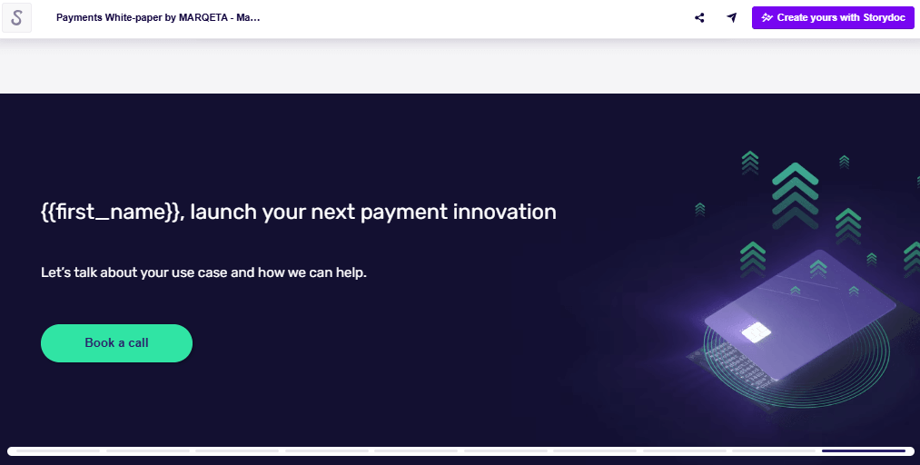
  • “Book a quick demo” - for product-focused papers

  • “Let’s talk” - for service-based or consultative offers

  • “Download the full guide” - to extend the value

  • “Sign up to get insights like this” - for ongoing engagement

White paper call to action example

NOTE: Need a refresher on the basic white paper structure and sections? See our intro guide on what is a white paper. You can also check out these top white paper examples to see these design principles in action.

Interactive white paper templates

Writing the content is hard enough - don’t make your life harder by building the layout from scratch or settling for a static, clunky PDF.

Interactive white paper templates let you focus on your message while giving your white paper the modern structure today’s readers expect.

With smooth navigation, engaging visuals, and built-in mobile responsiveness, they’re designed to help you tell a compelling story and make your content work harder for you.

Just grab one.

No templates found
Dominika Krukowska

Hi, I'm Dominika, Content Specialist at Storydoc. As a creative professional with experience in fashion, I'm here to show you how to amplify your brand message through the power of storytelling and eye-catching visuals.

Engaging decks. Made easy

Create your best white paper to date.

Stop losing opportunities to ineffective presentations.
Your new amazing deck is one click away!