This is a preview of your story

Powered by

Storydoc

Create a Sales One-Pager (Writing Tips, Examples & Templates)

See sales one-pager examples that sell, learn how to write a sales one-pager and what to include in your one-pager to take it from boring to irresistible.

Sales One-Pager

helped business
professionals at:

Nice Meta RTL Spot Xerox Pepsi

Short answer

What is a sales one-pager

A sales one-pager is a short single-page document that provides a concise overview of your company, product, or service. Its main purpose is to hook your potential customers with a snapshot of how you can solve their pain points and convince them to interact with you further down the sales funnel.

Writing a simple sales one-pager is complicated. 15 seconds… that’s how long it takes for prospects to decide whether they want to read your pitch. Giving them a poorly planned sales one-pager can turn people off before they’ve had a chance to actually read what you have to say.

You gotta make every second count. I’ll teach you all there is to know about creating a captivating sales one-pager that lassos in deals.

I’ll also give you our best sales one-pager examples so you can get down to work the moment you finish reading and make your boss happy.

Let’s get you where you need to go!

How to write a sales one-pager people love reading

The first step in delivering a compelling sales one-pager is knowing what you should include and what you can skip on the first touchpoint. Once you have that information, it needs to be structured in a way that is clear to navigate and follow.

Let me show you how to neatly package all the core elements of a sales one-pager to grab people’s attention and guide them down the funnel.

What should a sales one-pager include

Regardless of the specifics of your industry, a typical sales one-pager should include 7 basic sections.

7 elements a sales one-pager should include:

  1. Cover
  2. Introduction
  3. About us
  4. Problem
  5. Solution
  6. Details
  7. Next steps

Cover

Introduction

About us

Problem

Solution

Details

Next steps

chevron_right
chevron_left

Cover slide

The title of your sales one-pager, along with a company logo and a catchy tagline. It should hook your readers, for example by including an industry-related video or personalizing it for your prospects.

Introduction slide

It sets the readers’ expectations by providing an overview of your one-pager, particularly who your solution is for, what the main benefits are, and what sets your company apart.

About us slide

The part where you establish trust with your readers by talking about your goals, values, and expertise.

Problem slide

Identify the main pain points plaguing your target customers.

Solution slide

Show you can solve the problems you mentioned earlier better than your competitors and back it up with hard data.

Details slide

The part where you go in-depth into the features and benefits of your solution (that are particularly relevant to the target audience).

Next steps

An easy, clear, and compelling action that your prospect can take after viewing your one-pager (for instance, signing up for a free trial or booking a meeting).

How to structure a sales one-pager

A high-performing sales one-pager should be structured in the form of a narrative. It should organize your content along a chronological story arch that covers the 5 main content blocks of (1) problem, (2) solution, (3) vision of a better future, (4) roadmap, and (5) resolution.

Dave Schools, VP Multiproduct Growth at Hopin says it best:

“When Sales asks Marketing for a one-pager, they’re not just asking for a prettier document or information they already have. It’s a request to connect the dots between customers’ pain points and the company’s solutions/plans.”

The best way to connect all the dots is to wrap your sales one-pager up in a compelling narrative that guides readers through all the pieces of information and tells them what to focus on at any given moment.

Think of it this way - your prospect is Dorothy swept by storm to uncertainty (pain point), then having to follow the yellow brick road (your solution and guidance), meeting the wizard, and finally getting back home as a better version of herself (getting results).

Keep your sales one-pager centered on your prospect

A huge mistake many companies make when writing their sales one-pager is that they put their solution at the center of the narrative.

But the narrative should always be customer-centric and use the prospect’s perspective to outline how they can tackle their pain points using your solution (better than using competing solutions).

How to end a sales one-pager

Once you have the correct sales one-pager structure in place, one of the worst mistakes you can make is slapping some half-assed ending on it and calling it a day. Here are 3 tips on how to end a sales one-pager:


I) Don’t use a “thank you” slide

It may be polite but ending any sales collateral with a “thank you” slide is basically admitting that the value flowed from your prospects onto you - when it should be the other way around. If your solution is relieving them of acute pain, they should be thanking you, shouldn’t they?

More fundamentally, a “thank you” slide essentially closes off communication with your prospects. The end goal isn’t getting people to read the damn thing, it’s getting them to commit to the next step down the funnel.


II) Use a CTA with a small commitment (advance)

Instead of thanking your reader, offer them a way to further interact with you. Whether you want prospects to sign up for a free trial or book that next meeting, make it clear why they should and why now.


III) Embed the CTA directly in your sales one-pager

Convincing your reader of why they should take action now is one part of a 2-step dance. The other part is making it as easy as possible for them to take immediate action.

You can include an external link or, better yet, embed your calendar directly in your sales one-pager. The second option is only available with Storydoc’s sales deck creator. Now getting to that next step has never been easier.

Calendar integration

Bad practices for designing sales one-pagers

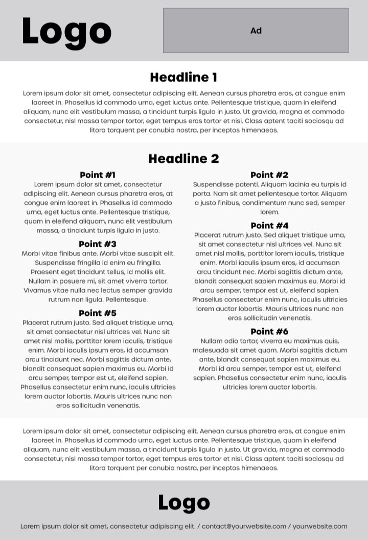
Many sales and marketing professionals still attempt to cram a complete and detailed narrative into a literal one-pager. This practice is an engagement killer.


The attempts to cram all the information onto a single dense page means that most sales one-pagers end up looking nightmarish like this (can you hear the Hitchcock violins screech in the background?):

Bad sales one-pager example

Nobody’s going to read something like this. It does not help your readers and it does not help you. If you’re still making sales one-pagers like this - please stop, I am asking on behalf of your prospects and your boss.

So, what’s the solution?

How to design sales one-pagers for engagement and conversion

Almost half of all outreach decks are opened on mobile devices, so giving your prospects a mobile-first experience is a must. If you don’t, this basically means losing half of your leads.

Static sales one-pagers are a real pain to read. People have to constantly pinch in and out to access the contents of your deck which causes them to disengage, drop off, and curse the sender (that’s you).

In case you’ve never read a PDF on mobile yourself, this is what it looks like (can you feel the frustration?):


static one pager in PDF format is hard to read

Designing static vs. interactive sales one-pagers

Interactive web-based sales one-pagers don’t have the constraints of regular PDF decks. As they’re scroll-based, the contents of your sales one-pager do not have to be confined to a single PDF sheet.

This means you can organize your content visually into bite-size sections with lots of white space in between. You can deliver interactive, multimedia experiences where the reader is in control of how to consume your content and how deep they want to go.

You can tuck in additional information into accordions under a “read more” button, or separate content for different decision-makers under tabs.

Sales one-pager

Best sales one-pager examples

If you want to take your sales one-pagers from boring to buzzworthy, I put together a gallery of our best performing interactive sales one-pager templates.

All of these templates were designed using Storydoc, with all of the sales one-pager best practices in mind. They’re all scroll-based, optimized for engagement, and look perfect on any device.

Whether a potential client opens your sales one-pager on a computer or views it on the go in-between meetings, you can rest assured that you’re always making your value proposition shine brighter than others.

They also come with an extensive library of visual components and data visualization elements to help make the contents of your sales one-pager easy to follow and understand, no matter how busy your prospects are.

Sales one-pager

What makes this sales one-pager great:

  • The "Learn More" button makes it easy to add additional information without overloading your prospects with text.
  • The ability to include external links means you can take prospects to the landing page that's directly relevant to their use case.

General business one-pager

What makes this sales one-pager great:

Product sales one-pager

What makes this sales one-pager great:

  • Dynamic variables allow you to personalize your sales one-pagers at scale with just a few clicks.
  • The ability to make edits in real-time. If any of your specs change, you just need to make the tweaks directly in the deck without having to resend it to your prospects.

Tech sales one-pager

What makes this sales one-pager great:

  • Narrator slide that allows you to explain how your solution works in a way that's easy to understand and follow.
  • Image and video placeholders enable you to present your solution in action rather than describe it in long paragraphs.

Modern one-pager

What makes this sales one-pager great:

  • Storytelling framework captures the essence of the deal-winning Zuora sales deck structure to make selling your vision as easy as can be.
  • Fresh, modern design grabs your prospects’ attention and convinces them to learn more about your offering.

Sales one-pager do’s and don’ts

Before you start working on your sales one-pager, it’s good to stop and cover the basics.

Don’t try to squeeze too much information into your sales one-pager. It will just overwhelm your prospects and cause them to look for the exit in search of safety.

Do keep it laser-focused on your prospects, their particular pain points and needs. When it’s someone’s first contact with your company, all they want to know anyway is: what can it do for me?

Don’t make your sales one-pager text- or data-heavy. At this stage, prospects have dozens of similar offers to compare, so nobody’s going to bother to wade through walls of text.

Do use interactive elements and see them boost engagement and how they get 41% more people to read the whole thing.

Don’t spray and pray. Don’t send your prospects a generic one-and-done one-pager that speaks to everyone and no one. The amount of lazy messaging like this we all get nowadays is horrifying. If you go the lazy generic way you will position yourself as just another spammer.

Do personalize. The best way to make clients feel special is by sending out well-informed dedicated versions of your sales one-pager.

It creates the impression that you took time out of your busy day to cater to their particular needs, even if all you did was customize a couple of fields and press ‘Send’.

For more info, check out our full guide on how to create an effective one-pager.

Sales one-pager templates

Crafting a compelling sales one-pager is a delicate balance between concise content and impactful visuals. In the fast-paced world of sales, you need a tool that quickly communicates value while leaving a lasting impression.

However, not every sales professional has the luxury of time or design expertise to create that perfect one-pager from the ground up. That's where our curated collection of sales one-pager templates comes into play.

Designed with sales communication in mind and optimized for maximum impact, these templates are your shortcut to creating a persuasive sales one-pager that resonates.

Grab one.

No templates found

Best tools to create sales one-pagers

Many product marketing managers and sales enablement professionals rely on standard website builders to create their sales one-pagers. They probably shouldn’t because there are faster and more reliable ways to do it that bring much better results.

Worse yet, some of them create static sales one-pagers using the likes of PowerPoint or Google Slides. I talk about why that’s a REALLY bad idea in the section on designing one-pagers for engagement and conversion.

If you wanna learn even more about this check out our article on static vs. interactive content.

To get the great performance you hope for you may want to consider using a dedicated one-pager builder.

The main difference between a dedicated one-pager builder and a website builder used for building one-pagers is that a dedicated builder works more like a presentation maker and does most of the heavy lifting for you, with content blocks that behave as pre-designed slides.


Here’s a list of our recommended one-pager builders:

  • Storydoc - Perfect for building interactive sales one-pagers and tracking their effectiveness
  • Elementor - An easy-to-use one-page website builder for WordPress with a drag-and-drop editor
  • Wix - An interactive one-page website builder with an extensive template gallery
  • Webwave - An AI website builder that can be used for creating interactive one-pagers
  • Squarespace - An all-in-one platform for building one-page sites with an intuitive editor
Dominika Krukowska

Hi, I'm Dominika, Content Specialist at Storydoc. As a creative professional with experience in fashion, I'm here to show you how to amplify your brand message through the power of storytelling and eye-catching visuals.

Engaging decks. Made easy

Create your best one-pager to date.

Stop losing opportunities to ineffective presentations.
Your new amazing deck is one click away!