Powered by

Learn to write a product one-pager for your sales pitch or internal proposal with step-by-step tips, examples, and interactive product one-pager templates.
A product one-pager, sometimes called a product one-sheet is a concise, visually engaging document that presents a product’s key features, benefits, and differentiators in a single page.
A product one-pager is designed to quickly inform potential buyers, investors, or internal stakeholders about the product’s value proposition.
Is a product one-pager the same as a product brief?
No, a product one-pager is usually an external-facing document used for sales, marketing, and investors, but it can also serve internal teams like sales and customer support.
A product brief, on the other hand, is an internal document focused on product development, features, and technical details for engineering and design teams.
Who is a product one-pager for?
A product one-pager is for prospective customers, investors, internal sales teams, partners, and media professionals. It provides a quick, high-level overview of a product’s value, helping different audiences understand its benefits and take action.
What are the goals of a product one-pager?
A product one-pager aims to quickly communicate key product benefits, support sales conversations, attract investors, and differentiate the product from competitors.
It helps potential buyers understand its value, encourages action (e.g., booking a demo or contacting sales), and ensures clear, consistent messaging across teams.
What assets do you need before writing a product one-pager?
Before you write a product one-pager, you need product details, competitive analysis, customer pain points, key differentiators, and a clear call to action.
Additional assets may include brand guidelines, sales decks, customer testimonials, and supporting data like a P&L analysis for investor-focused versions.
7 slides every product one-pager should include:
How to tailor your messaging
For executives: Keep it high-level - focus on business impact, ROI, and competitive advantage. No deep dives into features.
For technical buyers: They want the nitty-gritty, so highlight specs, integrations, and how your product solves their technical pain points.
For consumers: Make it engaging and benefit-driven. Show how your product fits into their life and solves a real problem they care about.
For mixed audiences: Use a layered approach - start with a compelling summary, then offer expandable sections or links for those who want more details.
How to make your one-pager stand out
Lead with impact. Your headline and tagline should quickly communicate your unique value proposition - what makes your product different and worth their time.
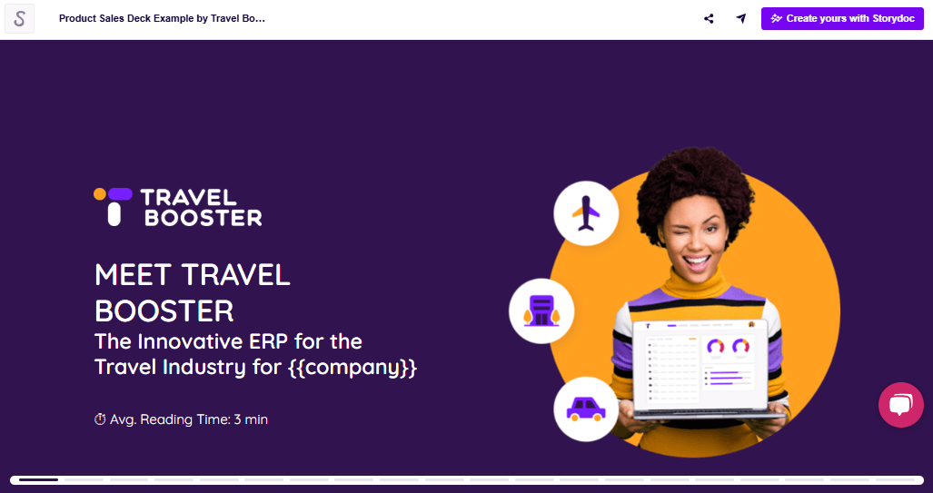
Make it personal. If possible, include the prospective client’s company name, their logo beside yours, and even the recipient’s name to make it feel tailored.
Use visuals wisely. Relevant imagery can reinforce your message, while subtle motion (like animations or a short video) can grab attention - just don’t overdo it.
Set expectations. A quick note on the expected reading time (e.g., 2-minute read) can help busy decision-makers commit to skimming through.
How to present the problem section
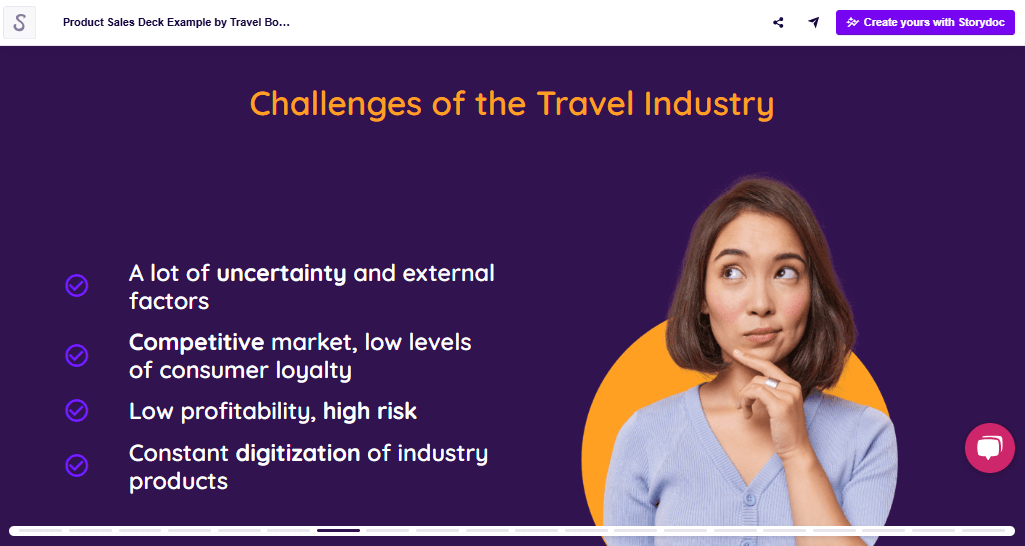
Get straight to the point. Describe the problem in a way that feels real and urgent. Skip vague statements - make it specific.
Show why it matters. Connect the problem to real business or personal pain points - lost time, high costs, inefficiency, frustration, missed opportunities.
Keep it short. This isn’t the place for a deep dive. A few sentences should be enough to make them nod along before you move into how your product fixes it.
How to write the benefits section
Turn “what” into “why.” Don’t just say your software integrates with 50+ tools - explain how that saves hours of manual work.
Make it relatable. Show how your product solves an actual problem. Does it speed up workflows? Cut costs? Remove frustration? Make that clear.
Use simple, direct language and avoid jargon. A benefit should be instantly understandable. If they have to think too hard about why it matters or decode technical lingo, you’ve lost them.
How to make your product one-pager customer-centric
Frame everything around their pain points. Instead of listing what your product does, show how it solves their specific challenges.
Use “you” more than “we.” Make the reader feel like you’re speaking to them, not just bragging about yourself.
Show outcomes, not just features. Don’t just say your software has AI-powered automation - explain how it helps them save 10 hours a week.
Make it feel tailored. If possible, include their industry, company name, or pain points so they instantly feel like this was made for them.
Keep the focus on impact. What happens when they use your product? Faster processes? More revenue? Less stress? That’s what they really care about.
How to personalize your deck with Storydoc
Address them by name. Just like you wouldn’t start a conversation without a greeting, don’t start your product one-pager without acknowledging your audience. A simple name mention makes it feel like a personal conversation rather than a generic pitch.
Use their company logo (for B2B products). Dropping in their logo alongside yours is an easy way to show you’ve tailored the content specifically for them. It reinforces that your message is relevant to their business, not just another copy-paste sales pitch.
Add a personal message (video or text). A short video or a custom note makes a massive difference. Whether it’s a quick “Hey [Name], excited to share this with you!” or a few lines about why this solution fits their needs, this touch builds connection and trust.
Personalize your call to action. Swap out generic “Contact us” buttons for something that speaks directly to their pain points - “Let’s tackle [specific challenge] at [their company] together.” It makes the next step feel like a natural continuation, not a forced sales push.
How to add social proof effectively
Drop in a testimonial. A single strong quote from a happy customer can make your product feel more legit and relatable. Keep it short and to the point.
Show off client logos. If big names use your product, flaunt it. A simple logo bar makes an impact without taking up much space.
Highlight a quick success story. A one-liner about how a customer saved time, increased revenue, or solved a major problem with your product can be more convincing than a paragraph of sales copy. And, with interactive one-pagers, you can easily add a link to the full case study.
How to keep your product one-pager concise
Use clickable tabs. Perfect for case studies, benefits, or features - let readers click through to the most relevant info instead of dumping everything at once.
Leverage multimedia. Replace long-winded explanations with short videos, animations, or visuals to make your points faster and more engaging.
Add collapsible "Read more" sections. Give readers the option to dive deeper without overwhelming them with too much text upfront.
Guide readers with grayed-out content. Subtly fade out secondary information so key takeaways pop first, leading them through the content smoothly.
Attach files, but only when necessary. If extra details are needed, add them as optional downloads - don’t clutter the one-pager with info better suited for later conversations.
How to end your product one-pager
I. Replace a “thank you” slide with a CTA with a small commitment on their part.
It can be anything to get them further along the path to buying your product, such as:
Sign up
Book a demo
Book a meeting
Download an ebook
Listen to a podcast episode
Read reviews
Take a virtual tour (e.g. in real estate)
II. Embed the CTA directly in your product one-pager
You can include an external link or (if you’re using Storydoc) embed your calendar directly in your product one-pager.
Storydoc gives other capabilities that standard one-pager creators can’t. We have integrations with all your favorite marketing and sales software, and they keep on coming.
Stop losing opportunities to ineffective presentations.
Your new amazing deck is one click away!


