Famous Pitch Deck Examples to Steal From (+Templates)

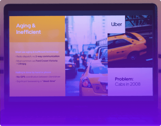
See example pitch decks by famous companies and VCs like Uber, Airbnb, WeWork, Netflix, Tinder, Dropbox, YouTube, Y Combinator, and more.

Famous pitch deck examples

helped business
professionals at:

Nice Meta RTL Spot Xerox Pepsi

Short answer

What makes a pitch deck successful?

A successful pitch deck combines clear storytelling, compelling visuals, and concise data. It highlights a real market need, presents a viable solution, unique value, and demonstrates strong growth potential.

The best pitch decks build both confidence and excitement, showing why this is the right team, solving the right problem, at the right time.

Famous pitch decks by successful companies

“Investors aren’t looking to say 'Yes', they are looking to say 'No.'”

-Gordon Miller, entrepreneur and investor.

Your pitch deck's primary goal is to break through the initial skepticism and get investors to consider your idea seriously.

At its core, a pitch deck is designed to pique interest, not to cover every detail of your business.

In the first stage, it's about sparking curiosity and opening doors. Then, as interest grows, it's about building trust and getting buy-in for your vision.

This is what these famous pitch decks did well.

But while learning from the best is a good idea, it's important to note that most of these famous pitch decks are old and static.

More modern pitch decks offer interactive content that is much more engaging, entertaining, and memorable.

So we took the liberty to remake these famous decks with interactive storytelling.

Disclaimer: The Storydoc team created these interactive famous pitch deck remakes based on publicly available slides. This is for demonstration purposes and doesn’t represent actual Storydoc decks used by these companies.

Airbnb

This is the pitch deck Airbnb used to raise their $600K seed round back in 2009 - and while it wouldn’t fly today, it got the job done.

It’s dead simple. No fancy visuals, no design flourishes, just a literal “Problem” slide followed by a “Solution” slide. But it does explain the core idea clearly: letting strangers sleep in your house for money.

At the time, that sounded insane. The founders even had to revise their market size mid-fundraise after being told their numbers were too small (they were estimating millions… not billions).

It’s a great reminder: clarity beats polish, but if you’re pitching today, you’ll need a stronger narrative and a lot more finesse.

Uber

Uber’s 2008 pitch deck is a time capsule from when “ride-hailing” wasn’t a thing yet.

They raised $200K with a clean presentation that got straight to the point: taxis were broken, and cities needed smarter transport.

What stands out is how Uber framed itself not just as a convenient app, but as a premium service - "everyone’s private driver."

The market analysis is surprisingly focused on affluent users (think executives, frequent flyers, iPhone owners), which tells you exactly who they were chasing early on.

No big promises, no global takeover talk - just a smart fix to a painful problem. It’s proof that when the idea is strong, you don’t need to shout.

Netflix

Netflix’s pitch deck is a masterclass in spotting where the industry’s stuck - and kicking the door open.

It zeroes in on a broken model: physical distribution, limited choice, and the kind of user experience that felt like it hadn’t changed since the ‘90s. Their answer was a seamless, ad-free, on-demand streaming experience built around personalization.

What’s smart is how clearly they present their mission to scale globally and become the go-to OTT platform, long before that was the norm.

Now, to be fair, the original “pitch” wasn’t a formal deck at all - it actually started as an informal email to journalist Harry McCracken back in 2001. What you’ll see here is a reimagined version based on that early vision, shaped into a modern pitch format.

WeWork

WeWork’s 2014 Series D pitch deck is peak “visionary energy” - slick, dramatic, and packed with grand ideas about redefining the modern workspace.

It wasn’t just about renting desks; it was about fueling a global movement of creators through space, community, and meaning.

The deck placed strong emphasis on WeWork’s rapid growth and cultural mission, backed by bold graphics and even bolder language.

If you’ve seen WeCrashed, you already know - this thing had “we’re gonna change the world” energy cranked to 11. It helped secure a $5B valuation, and honestly, with Adam Neumann pitching it, he probably could’ve sold that vision to a brick wall.

Tinder

Tinder’s early pitch deck went the storytelling route - and honestly, that was a smart move.

Instead of drowning investors in metrics, it opened with “Matt,” a fictional guy who’s bad at dating. Relatable? Absolutely.

It framed the problem in human terms, then dropped the solution: a frictionless, swipe-based way to meet people without the sting of rejection.

The deck hit the key differentiators - mutual interest, shared friends, local matching - and even included a live demo to show how addictive the experience was.

YouTube

YouTube’s original pitch deck was bare-bones - just 10 slides - but it did what it needed to: sell a big idea.

It framed video sharing as a pain point most people hadn’t even articulated yet (remember, this was pre-iPhone, pre-streaming era), and positioned YouTube as the simple, tech-friendly fix.

It leaned on Adobe Flash and HTML5 to show how videos could be shared and embedded easily - at a time when that was still a technical headache.

No wild graphics, no buzzwords - just a clean, clear pitch about making video accessible to everyone. Basic? Yes. But the vision? Spot on.

Y Combinator

This Y Combinator pitch deck isn’t a real deck - it’s a mock example built around the content structure YC recommends to every founder.

And while the tone is intentionally tongue-in-cheek (emojis and all), the underlying framework is rock solid.

It tackles the most common reason seed decks fail: they’re too vague, too fluffy, or trying too hard to impress.

YC’s version cuts straight to the point - problem, solution, market, traction, team - no filler, no posturing.

It’s not meant to be used slide-for-slide, but it is a great blueprint if you want to build a pitch deck that respects investors’ time and actually gets read.

Sequoia Capital

This Sequoia pitch deck example, like the Y Combinator one we just covered, isn’t a real pitch - it’s a template.

It’s the exact structure Sequoia Capital recommends founders use when pitching them, and it’s designed to do one thing exceptionally well: help you cut the fluff.

It forces you to get laser-focused on your problem, your market, and why now is the time to build. It’s clean and investor-friendly.

This example happens to be tailored for a healthcare startup, but the structure is flexible enough to work across industries. Just don’t follow it so literally that your Sequoia pitch ends up sounding like everyone else’s.

Dropbox

Dropbox’s 2007 pitch deck is a great example of how to explain a deceptively simple idea with real conviction. It helped them raise $1.2M from Sequoia by solving a universal headache: keeping files in sync across multiple devices.

What made it work wasn’t flashy design or wild projections - it was clarity. The deck framed the problem perfectly (too many devices, too many files, nothing talks to each other) and positioned Dropbox as the clean, reliable fix.

The business model - freemium for individuals, per-seat for teams - felt grounded, and the focus on “user love” and viral growth showed real insight. It was a technical pitch, yes, but with just enough vision to make investors lean in.

Tesla

Tesla’s 2011 pitch deck is a look back at when Elon Musk was still convincing investors that electric cars weren’t just science projects. It wasn’t just about sleek vehicles - it was a full-blown mission to reshape transportation and energy.

The deck builds its case around their core differentiator: battery innovation. It also teased the upcoming Model S and highlighted partnerships with names like Toyota and Panasonic (big names for a company still proving itself).

What stood out was how confidently they laid out their expansion plan, especially around the Fremont facility buildout.

Shopify

Shopify’s 2016 pitch deck wasn’t about proving they were growing - it was about showing they’d already become the backbone of online commerce.

This was a late-stage deck, and it had the numbers to match: 200,000+ active merchants, billions in GMV, and a platform that didn’t just support stores - it powered an entire ecosystem.

What stood out wasn’t just the scale, but how Shopify positioned itself as the operating system for commerce across every channel - web, mobile, social, POS, you name it.

The deck was polished, confident, and forward-looking, with a clear plan for global expansion and product development.

Loom

Loom’s 2017 seed deck is a textbook example of how to pitch a simple-but-powerful idea with laser focus.

It wastes no time: straight out of the gate, it taps into a universal pain - never-ending message threads, meetings that should’ve been emails, and emails that should’ve been videos.

Then, they pitched async video as the faster, clearer way to communicate at work. And it worked - they raised $3M off the back of this.

What really sold it wasn’t just the problem - it was the proof. The deck showed the product in action, backed by strong early adoption, and the team slide gave investors confidence that it was a real company in the making.

Buffer

Buffer’s 2011 seed deck is a great reminder that traction talks - and it talks loud.

With 55,000 users and $150K in ARR in their first year, Buffer didn’t need a flashy pitch. The deck had its gaps, sure, but it didn’t matter.

What made this one work is how clearly they framed themselves as a business tool, not just a nice-to-have social app.

Instead of vague “share better” language, they positioned Buffer as something that drives revenue - something a marketing team could justify paying for.

The business model was crystal clear, and the milestones slide showed real numbers. That’s what gave investors confidence.

Mixpanel

Mixpanel's 2014 Series B pitch deck is a lesson in how to court investors when you're no longer the new kid on the block.

By this stage, it's all about proving you've got a well-oiled machine that's ready to scale, and Mixpanel delivered just that.

Mixpanel leaned hard into the numbers, and rightly so. ARR nearly tripled one year and doubled the next, painting a picture of a company on a steep upward trajectory.

But what really stood out was their two-year expansion plan, demonstrating not just where they were, but exactly where they were headed.

Supermetrics

Supermetrics’ 2020 Series B deck is a great example of how to turn a painfully boring problem into a seriously compelling pitch.

They took something every marketer dreads - manual data wrangling - and turned it into a must-have product.

Automating marketing data integration isn’t flashy, but the deck made it crystal clear: in a world drowning in spreadsheets, this tool is a lifesaver.

What really sold it was the traction - 14,000+ paying customers and impressive year-over-year growth.

They didn’t just say marketers wanted it - they proved people were already paying for it. Investors didn’t need convincing - it was all right there in the numbers.

Paddle

Paddle’s 2020 Series C deck hit at exactly the right moment. SaaS was exploding during the pandemic, but behind the scenes, companies were still drowning in billing headaches and tax compliance chaos.

Paddle positioned itself as the all-in-one solution to that mess - a way for software businesses to scale without getting buried in cross-border payments and admin work.

The deck hammered that pain point hard, backed by real traction: 2,000+ software sellers in 245 countries and a clear plan to grow even further.

It was exactly the kind of pitch investors love - remove complexity, show scale, and let the product do the talking.

Canva

Canva’s 2015 Series A deck is exactly what you’d expect from a design-first startup - clean, simple, and straight to the point.

It opens with a problem just about everyone can relate to: design is hard, and most people don’t have the tools or skills to do it well.

Canva’s pitch was about making design easy for everyone. The deck doubles down on traction - over 750,000 users in year one - which is exactly what Series A investors want to see.

It did the job, too - they raised $6.6 million to take their vision to the next level.

Guy Kawasaki

The Guy Kawasaki pitch deck example below isn’t based on a real deck - it’s our take on what a pitch might look like if you followed the 10/20/30 rule.

For context, Guy’s guidelines suggest keeping it to 10 slides, presenting in 20 minutes, and using no font smaller than 30 points.

Back when founders were pitching in boardrooms with clunky projectors, that advice was gold - and honestly, most of it still holds up.

The structure is clear, direct, and easy to follow. But today, there’s nothing wrong with going over 10 slides if you need the space - clarity matters more than slide count.

That’s why we built this version to stay lean without forcing your story into too tight a box.

Want to apply these principles to your own deck? Check out our Guy Kawasaki pitch deck guide.

Create your pitch deck from a template

Building a pitch deck is a big task, especially when you know investors might make up their mind in the first few slides and your startup’s future might depend on it.

You’re trying to tell your story, show traction, and make the case for funding, all while wondering if you’ve structured it right.

Interactive pitch deck templates follow the same structure we’ve seen work for countless successful startups, so you don’t have to start from a blank page or second-guess every slide.

You can focus on your content, and know the framework’s already solid.

Just grab one.

No templates found
Dominika Krukowska

Hi, I'm Dominika, Content Specialist at Storydoc. As a creative professional with experience in fashion, I'm here to show you how to amplify your brand message through the power of storytelling and eye-catching visuals.

Engaging decks. Made easy

Create your best pitch deck to date.

Stop losing opportunities to ineffective presentations.
Your new amazing deck is one click away!