Data Visualization Slide Types & How to Use Them (+Examples)

Learn what are data visualization slides, how to use them, and how to easily make them for your next presentation with customizable examples and templates.

Data visualization slide types

helped business
professionals at:

Nice Meta RTL Spot Xerox Pepsi

Short answer

What are data visualization slides?

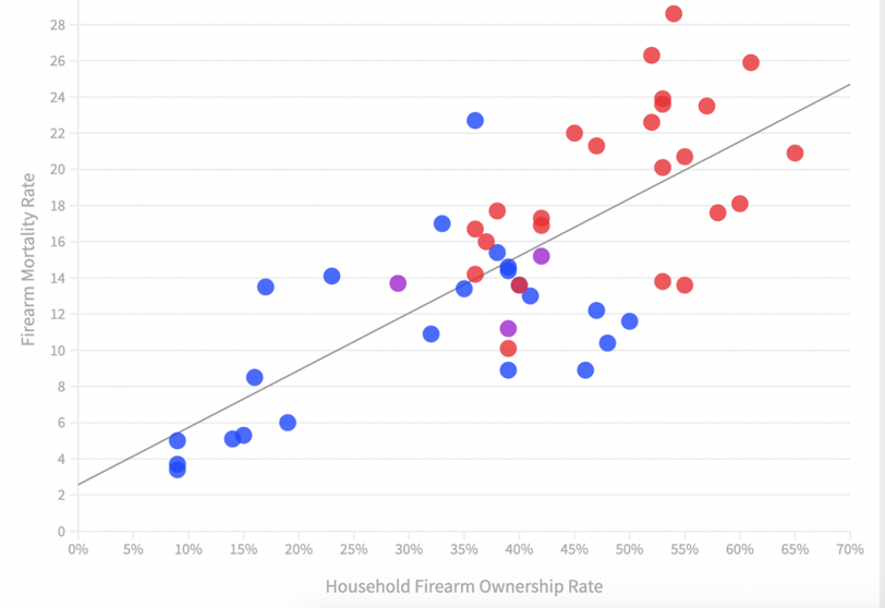
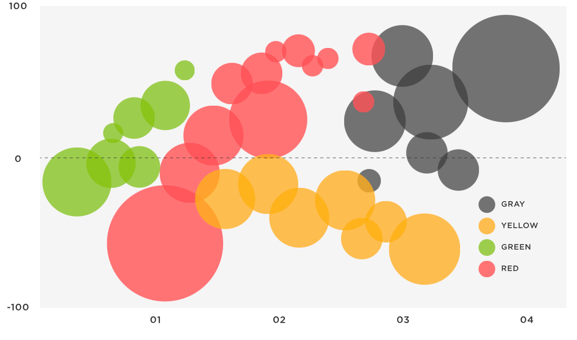
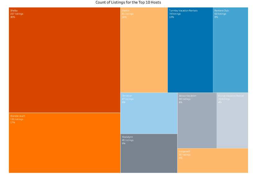
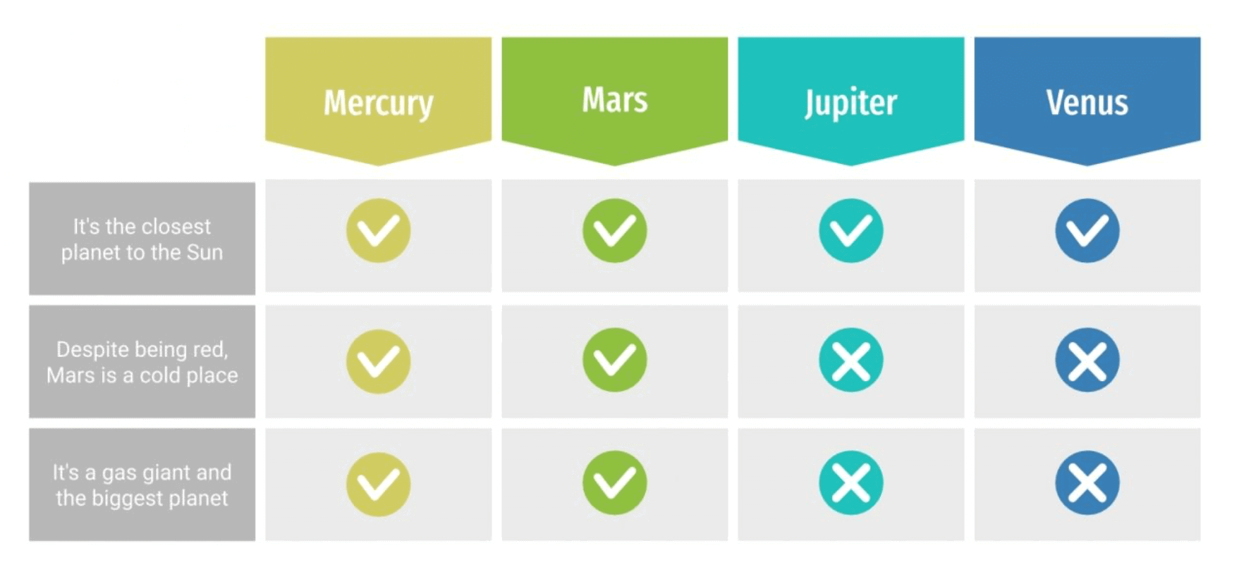
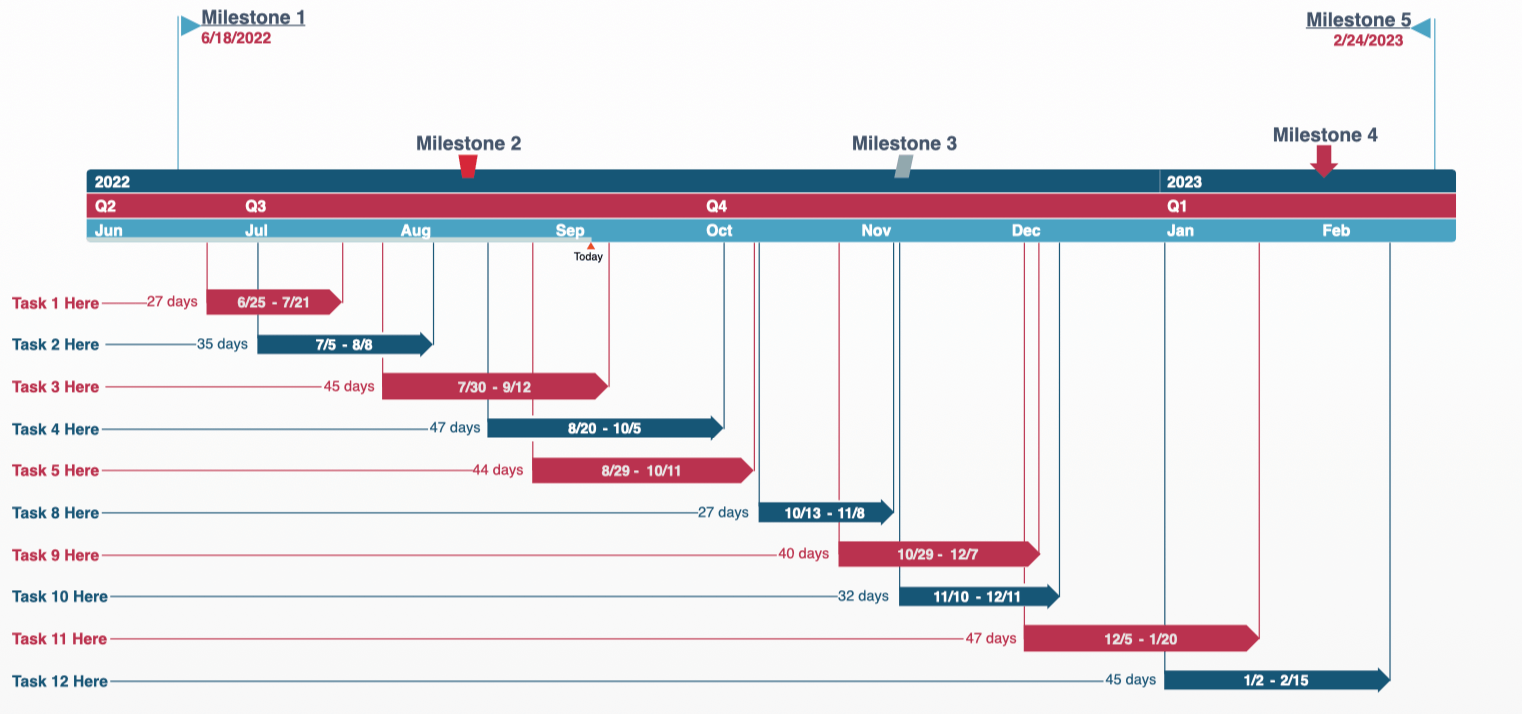
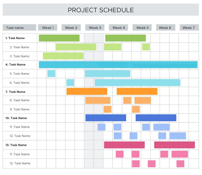
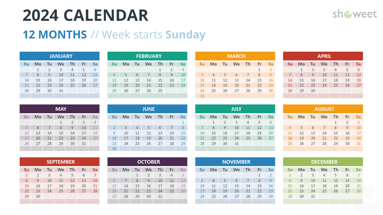
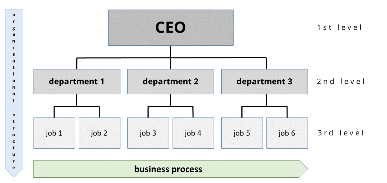
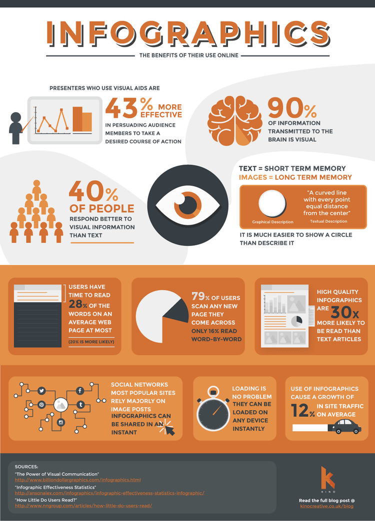
Data visualization slides are presentation slides with a chart, graph, table, map, or infographic. Data viz slides are used to organize numerical or textual information into visual representations that help the viewer understand complex information and focus on what matters.

The role of data visualization in presentations

Data visualization uses visual representations of data like charts, graphs, maps, tables, and infographics to leverage people’s intuitive understanding of visual information.

Such intuitive concepts as size, proportions, time, relationships, hierarchy, and location make complex information easier to understand.

Since the human brain processes visual information 10 times faster than text and numbers, visualizing data makes it much easier and faster to process.

It reduces cognitive load and turns unintelligible numbers and facts into visual stories that aid in making data-driven decisions.

Foundational slide types

These slides introduce your data, giving the essential background and context your audience needs to understand why the information is important and relevant.


1) Bar graphs: Visualizing comparisons

Bar graphs are great for comparing different groups or categories. The bars represent data values, making it easy to spot differences and trends.

Bar graphs are great for showing how things change over time. You can also use them to compare different things in the same group.

Bar graph

2) Line graphs: Illustrating trends over time

Line graphs are perfect for showing trends over time. They connect data points with lines, helping you see how something changes.

Line graphs come in handy when you want to understand how data changes over time. You can use graphs to see patterns like sales, weather, or money value.

Line graph

3) Pie charts: Displaying proportions

Pie charts show how different parts make up a whole. Each slice on the chart shows how much a category contributes to the whole.

This makes pie charts great for showing a budget distribution or how much of the market each company owns.

These charts are not as useful for showing big data sets or making exact comparisons.

Pie chart

4) Scatter plot charts: Showing relationships

You can use scatter plots to show the relationship between the two variables. In a scatter plot, each dot represents a pairing of values from two variables.

You put one variable on the x-axis and the other on the y-axis. By looking at how the dots spread out, you can see if there's a connection between the two variables.

If the dots form a pattern, like a line or a curve, it shows there's a relationship. If they're all over the place, there's no clear connection.

Scatter plot chart example

5) Bubble charts: Presenting multivariate data

Bubble charts are like scatter plots but with a third dimension: bubble size. These graphs help show connections between three things.

For example, they can show how sales change based on location and product type.

Bubble chart example

6) Tree maps: Representing hierarchical data

Treemaps represent hierarchical data by using nested rectangles. Each rectangle represents a category, and its size indicates its data value.

Treemaps help show a lot of information sorted into groups. They let you see how much each category contributes to the data set.

Tree map example

7) Table slides: Organizing information

Tables are like boxes that organize data into rows and columns. This makes it easy to find and compare specific values across different categories.

Tables are a great way to show exact numbers. You can use them for financial statements, product details, or survey results. They might not look as exciting as graphs or charts, but they are great for showing exact numbers.

Table slide example

Time-based visualizations

This section includes visualizations such as timelines and calendar slides, which are perfect for highlighting trends and changes over time.


1) Timeline charts: Sequencing events

A timeline chart is like a visual map that shows events or activities over time. It's a line or bar that stretches from one point to another, representing a period of time.

You mark each event or activity on the line or bar at the time it happens. You can mark when you start the project, finish planning, start working, and when you finish.

This helps everyone see what's happening and when, like a roadmap for the project.

Timeline chart example

2) Gantt charts: Managing projects

Gantt charts are a type of bar chart that represents a project schedule. These show when project parts start and end. This includes tasks, milestones, and dependencies.

Gantt charts are super helpful tools used in project management. They help plan, schedule, and track how a project is going.

Gantt chart example

3) Calendar slides: Highlighting timeframes

Calendar slides display data in a calendar format, highlighting specific timeframes or events. These calendars help you plan and schedule things.

They show you important dates, deadlines, and activities in a clear way. Calendar slides are super useful in presentations that must have detailed time planning.

For example, marketing campaigns, event planning, or academic schedules.

Calendar slide example

Hierarchical and organizational visualizations

These slides use tree diagrams and organizational charts to show data structures and hierarchies, making complex relationships and organizational setups easy to understand.


1) Organizational charts: Illustrating structure

Organizational charts look like maps that help you see the structure of your company. They show who's in charge of whom, which departments exist, and who does what job.

These charts show who reports to whom. This makes it easier for everyone to understand their roles.

Organizational chart example

2) Flow charts: Mapping processes

Flow charts are like maps. They show each step of the process. They use symbols and arrows to show actions, decisions, and paths.

Flow charts make it easy to see how a process works. They help us understand and follow complex processes when presenting at a daily meeting or standup call.

Flow chart example

3) Decision tree charts: Analyzing options

You can use decision tree charts to visualize decision-making processes. They are like maps with different paths.

They start at a main point with branches showing different choices and results. With their help, you can see what might happen in different situations so you can choose the best thing to do.

Decision tree chart example

4) Fishbone diagrams: Identifying causes

A fishbone diagram is also called an Ishikawa or cause-and-effect diagram. It's a tool used to find the main reasons for a problem.

They resemble the skeleton of a fish, with the problem at the head and causes along the spine. Fishbone diagrams are great for finding and fixing problems.

They help break down problems into smaller, easier-to-understand parts.

Fishbone diagram example

Comparison and relationship visualizations

These slides include Venn diagrams, quadrant layouts, and hub-and-spoke designs to show relationships, categorize data, and highlight connections.


1) Venn diagram slides: Showing relationships among sets

Venn diagrams show how different groups relate to each other. Each group is a circle, and where the circles overlap shows what they have in common.

Venn diagrams are like pictures that show how things are similar and different. You can use them to compare customers, products, or research findings.

Venn diagram example

2) Quadrant slides: Classifying data

Quadrant slides split data into four sections. Each part shows a different group based on two categories.

These slides are ideal for contrasting aspects like level of risk, or performance. Quadrant slides help identify patterns, strengths, and weaknesses within the dataset.

Quadrant slide example

3) Hub and spoke slides: Displaying connections

Hub and spoke slides visually depict how a central idea (hub) connects to related ideas (spokes). They're useful for showing networks, dependencies, or relationships within a system.

In project planning, the main goal is the center, and the tasks or milestones are like the spokes of a wheel. They're handy for organizing groups, outlining project components, or planning systems.

Hub and spoke slide example

Creative visualizations

This section features mind maps and word clouds to creatively visualize concepts, ideas, and word frequencies.


1) Mind map slides: Visualizing concepts and ideas

Mind maps are visual diagrams that organize information around a main idea. The branches of the mind map show related ideas or topics.

Mind maps are useful for brainstorming, planning, and organizing thoughts. They help people see the connections between different concepts and ideas.

Mind map example

2) Word cloud slides: Highlighting word frequency

Word clouds show words in different sizes based on how often they appear or how important they are.

They show us the words that appear the most in data, like surveys, social media posts, or text analysis. Word clouds give us a picture of the data and what's important.

Word cloud slide example

3) Sunray diagrams: Representing multidimensional data

Sunray diagrams, also known as radial charts, display various data types in a circular format. Imagine the chart as a circle, with lines coming out from the center like spokes on a wheel.

Each line represents a different aspect or category you're interested in. Then, data points are plotted along these lines to show how each aspect compares.

These graphs help us compare how well products are or what people think about them.

Sunray diagram example

Specialized visualizations

These slides feature Kanban boards and infographics to help manage workflows and clearly communicate complex information.


1) Kanban slides: Managing workflow

Kanban slides use cards or columns to show tasks and their statuses. They help project managers track progress, manage tasks, and see workflows.

Kanban slides are especially useful for agile project management. They help teams stay organized and efficient.

Kanban board example

2) Infographics: Communicating complex information

Infographics are a way of presenting information. They use text, images, and graphs to make complex information easy to grasp.

You can use these to share data, research findings, or explain ideas. Pictures and drawings can make your presentation more fun and easier to understand.

Infographic example

Tips for effective data visualization

1) Creating effective visuals

  • Simplicity. Keep your designs simple and tidy. Don't add things that don't need to be there. They can take people's attention away from what's important.

  • Consistency. Choose colors, fonts, and styles that go well together.

  • Readability. Ensure text and data are easy to read. Use appropriate font sizes and colors for better visibility.

  • Emphasis. Highlight important information by using different colors or adding notes.


2) Creating engaging visuals

  • Interactive elements. Use clickable parts, filters, and drill-downs to grab your audience's attention.

  • Storytelling. Write a story about the information to make it more interesting and easily understood.

  • Animation. Use animations to show important things and grab attention, but don't use them too often.


3) Avoiding confusing visuals

  • Overcomplicating. Keep it simple. Don't overwhelm your audience with too many details or complicated visuals.

  • Misleading scales. Make sure the labels on charts are clear and match the data accurately so people don't get confused.

  • Ignoring context. Give more information and explanations about the data you show. This will help people understand why it's important.

Data viz slide templates

Creating data visualization slides from scratch requires design skills or paying a designer.

To get this obstacle out of your way, but also make the creation process much faster and cheaper I collected a few data slide templates you can use to start off.

All our data viz slides are interactive and adapt automatically to the inputs you put in. They also automatically take on your presentation color pallet and design preferences.

Grab one!

Create story
from scratch

Data analysis
Data analysis slide
Use template
Data conclusions
Data conclusions slide
Use template
General data
General data slide
Use template
Our discoveries
Our discoveries in data slide
Use template
Survey results
Survey results slide
Use template
Oleksandra Shubovych

Oleksandra Shubovych is a Link Building and Outreach Specialist at Growthmate, an SEO marketing agency that helps small and midsize brands grow in SERPs and generate more revenue.

Engaging decks. Made easy

Create your best data viz presentation to date.

Stop losing opportunities to ineffective presentations.
Your new amazing deck is one click away!